9 Best Automated Support Reporting Dashboards in 2026
Support teams waste hours on manual reporting when they should be helping customers. The best automated support reporting dashboards pull data from helpdesks, CRMs, and communication tools to deliver real-time insights on ticket volumes, resolution times, CSAT scores, and agent performance—without spreadsheet work. This guide evaluates nine leading solutions based on automation capabilities, integration options, visualization quality, and speed to actionable intelligence, helping you choose the right automated support reporting dashboard to transform your customer service operations.
Support teams are drowning in data but starving for insights. Between ticket volumes, resolution times, customer satisfaction scores, and agent performance metrics, the manual reporting grind consumes hours that could be spent actually helping customers. Automated support reporting dashboards solve this by pulling data from your helpdesk, CRM, and communication tools—then transforming it into actionable intelligence without the spreadsheet gymnastics.
This guide covers the top solutions for teams that want real-time visibility into support operations, from AI-native platforms with built-in analytics to dedicated BI tools designed for customer service metrics. We evaluated each based on automation depth, integration flexibility, visualization quality, and time-to-insight. Here are the top automated support reporting dashboards transforming how teams understand and improve customer experience.
1. Halo AI
Best for: Teams wanting AI-powered support operations with built-in business intelligence that learns continuously
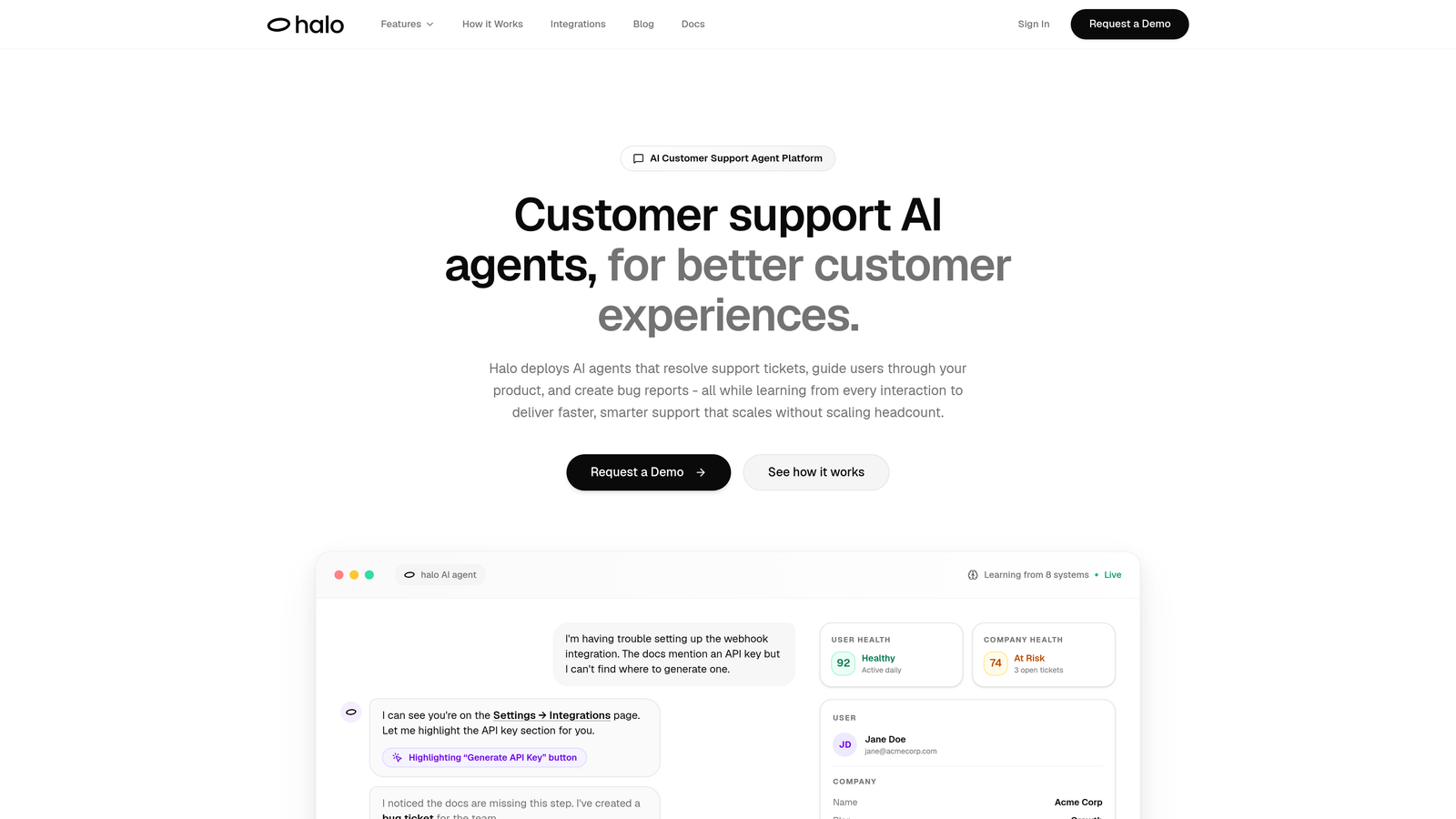
Halo AI takes a fundamentally different approach by combining support automation with native analytics—your dashboard doesn't just report on what happened, it powers the AI agents resolving tickets in real-time.
Where This Tool Shines
Unlike traditional dashboards that simply visualize historical data, Halo's Smart Inbox connects support interactions directly to business outcomes. The platform sees what your customers see through page-aware context, then surfaces insights that matter: which customers are at risk, which product areas generate the most friction, and how support interactions correlate with revenue.
The continuous learning architecture means your reporting gets smarter with every ticket. Anomaly detection flags unusual patterns before they become crises, while revenue intelligence connects support conversations to actual business impact through integrations with Stripe, HubSpot, and your entire business stack.
Key Features
Smart Inbox Analytics: Real-time support metrics combined with customer health signals and risk indicators.
Revenue Intelligence: Connects support interactions to business outcomes through Stripe, HubSpot, and CRM integrations.
Anomaly Detection: Proactively identifies unusual patterns in ticket volume, resolution times, or customer sentiment.
Multi-System Reporting: Unified dashboards pulling from Linear, Slack, Zoom, PandaDoc, and helpdesk platforms.
AI-Powered Insights: Learns from every interaction to surface actionable intelligence, not just historical metrics.
Best For
B2B companies and product teams who want support analytics that inform action, not just observation. Particularly valuable for teams using multiple systems (helpdesk, CRM, project management) who need unified reporting without manual data consolidation. Ideal if you're scaling support without proportionally scaling headcount.
Pricing
Contact for pricing; demo available to see the Smart Inbox and business intelligence capabilities in action.
2. Zendesk Explore
Best for: Zendesk users needing native analytics with minimal setup and pre-built support dashboards
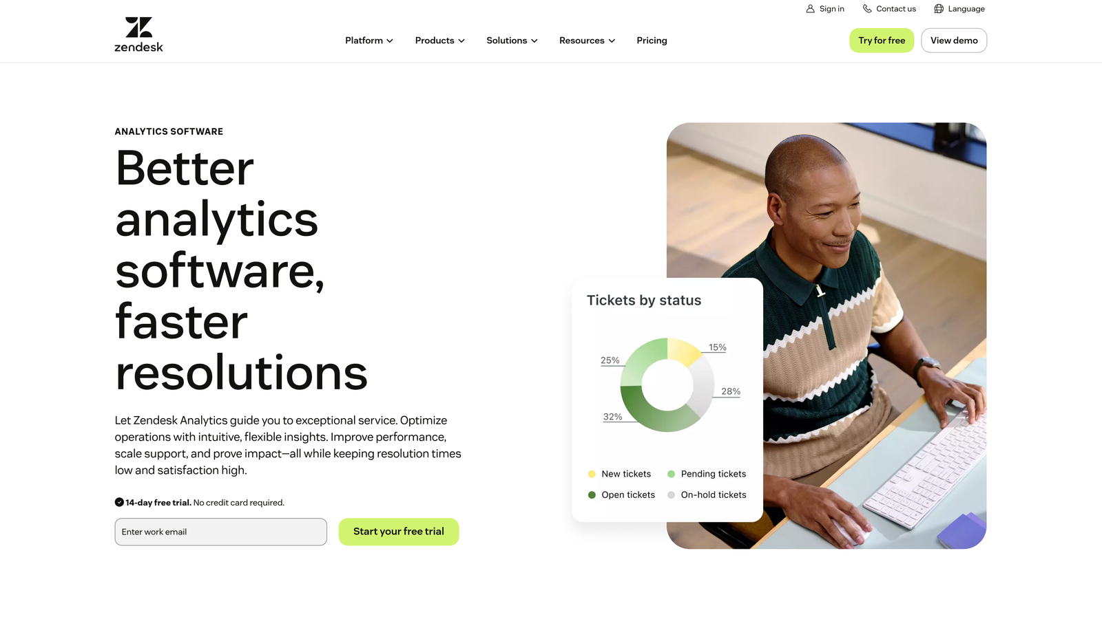
Zendesk Explore provides built-in analytics specifically designed for Zendesk environments, offering the fastest path to reporting if you're already in their ecosystem.
Where This Tool Shines
The pre-built dashboard library covers the metrics most support teams track daily: ticket volume trends, first response times, resolution rates, and customer satisfaction scores. You can start analyzing support performance within minutes of activation, no custom configuration required.
The custom report builder balances accessibility with power. Non-technical team members can drag and drop metrics to create new views, while more advanced users can build complex reports with custom calculations and filters across channels—email, chat, phone, and social media interactions all appear in unified dashboards.
Key Features
Pre-Built Dashboards: Ready-to-use templates for ticket analysis, team efficiency, and customer satisfaction tracking.
Custom Report Builder: Drag-and-drop interface for creating tailored reports without SQL knowledge.
Cross-Channel Reporting: Unified view of support interactions across email, chat, phone, and social platforms.
Scheduled Delivery: Automated report distribution via email with customizable frequency and recipient lists.
Historical Analysis: Access to real-time and historical data for trend identification and forecasting.
Best For
Teams already using Zendesk Suite who want analytics without adding another tool to their stack. Works well for support leaders who need executive-ready reports with minimal customization effort.
Pricing
Included with Zendesk Suite plans; available as standalone add-on starting at $9 per agent per month.
3. Freshdesk Analytics
Best for: Freshworks users seeking curated support reports with agent performance gamification
Freshdesk Analytics delivers native reporting for Freshworks environments with particular strength in agent productivity tracking and team performance visualization.
Where This Tool Shines
The curated report library focuses on the metrics that drive support team improvement: ticket volume patterns, SLA compliance rates, resolution time distributions, and customer satisfaction trends. Each report includes context-specific insights that help managers understand not just what the numbers show, but why they matter.
Agent performance dashboards integrate with Freshdesk's gamification features, turning productivity metrics into motivational tools. Team members can see their individual stats, compare performance against goals, and track improvement over time—all within the same interface they use for ticket management.
Key Features
Curated Report Library: Pre-configured reports for ticket volume, SLA tracking, and resolution time analysis.
Agent Performance Dashboards: Individual productivity metrics with gamification elements for team motivation.
CSAT Trend Analysis: Customer satisfaction tracking with drill-down capabilities to identify improvement opportunities.
Custom Report Builder: Flexible filtering and grouping options for creating department-specific views.
Automated Exports: Scheduled report delivery via email with CSV and PDF format options.
Best For
Support managers using Freshdesk who want to motivate teams through transparent performance metrics. Particularly effective for organizations that value agent coaching and continuous improvement culture.
Pricing
Included with Freshdesk Pro plans at $49 per agent per month and higher tiers; not available on basic plans.
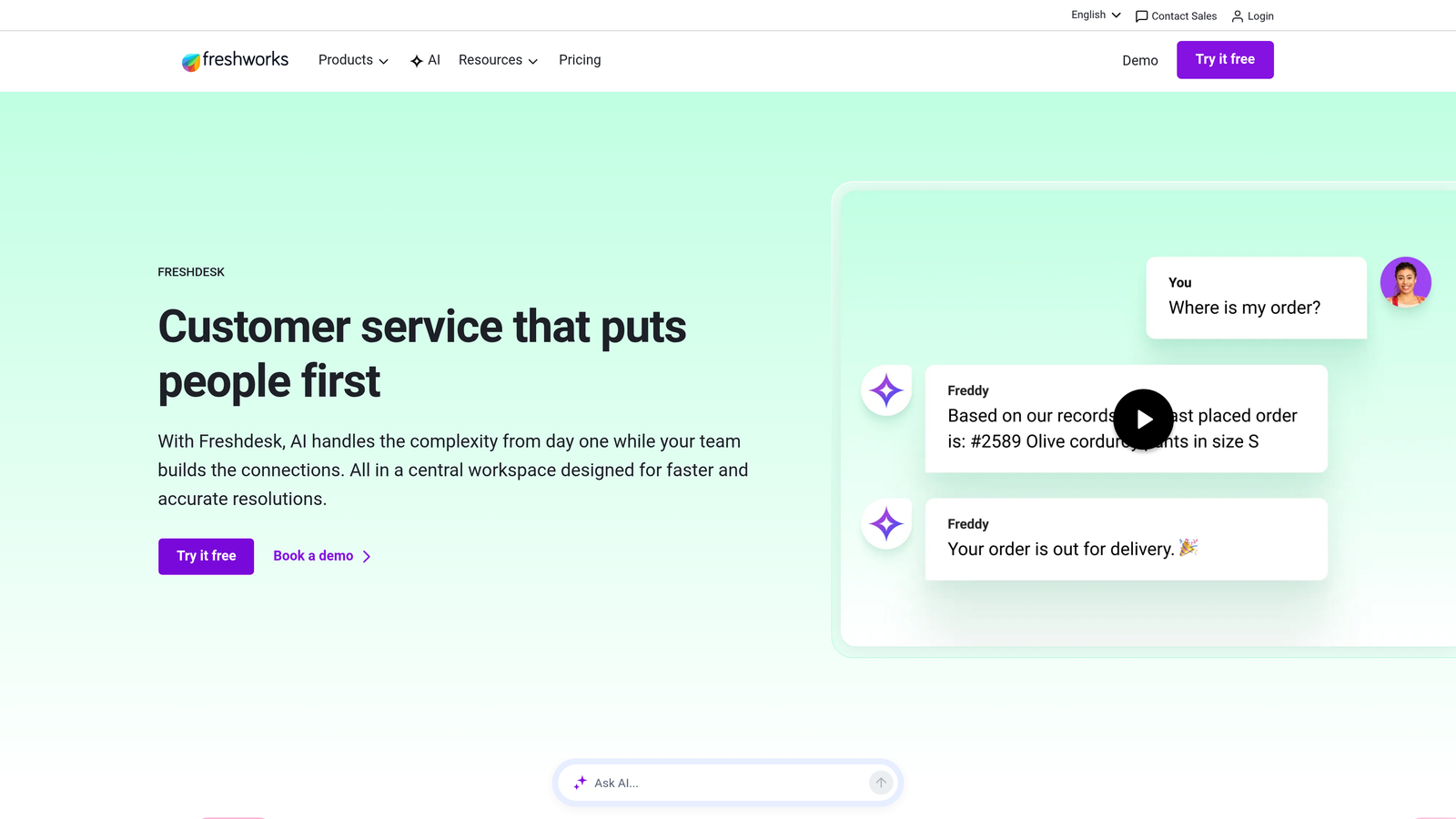
4. Intercom Reporting
Best for: Conversational support teams tracking real-time chat metrics and AI agent performance
Intercom Reporting focuses on conversational support analytics, with particular depth in measuring how effectively teams handle real-time customer interactions.
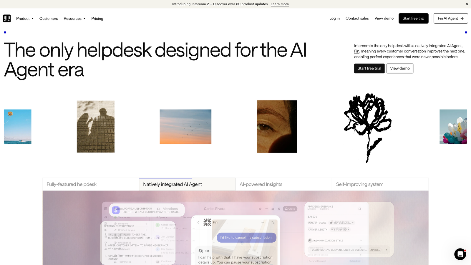
Where This Tool Shines
Real-time conversation metrics update as interactions happen, giving team leads immediate visibility into workload distribution, response times, and resolution rates. This live view proves invaluable during high-volume periods when you need to redistribute work or identify bottlenecks as they form.
The Fin AI resolution tracking stands out for teams using Intercom's AI agent capabilities. You can see exactly which types of questions the AI resolves independently, where it struggles, and how to improve its performance—analytics that directly inform AI training and conversation routing rules.
Key Features
Real-Time Metrics: Live conversation tracking with immediate visibility into team performance and workload.
Fin AI Analytics: Resolution rate tracking and optimization insights for AI-powered conversation handling.
Custom Report Builder: Flexible date ranges and filtering for analyzing specific time periods or conversation types.
Conversation Tagging: Analytics based on custom tags for tracking topics, issues, or customer segments.
Workload Distribution: Team inbox views showing conversation assignment and individual agent capacity.
Best For
Teams running conversational support through Intercom who need to balance AI automation with human agent efficiency. Especially valuable for organizations measuring the ROI of AI support investments.
Pricing
Reporting capabilities included with Intercom plans starting at $39 per seat per month; advanced features in higher tiers.
5. Geckoboard
Best for: Teams wanting TV-ready dashboards that display real-time support metrics in office spaces
Geckoboard specializes in creating visually striking dashboards designed for large displays, turning support metrics into always-visible team motivators.
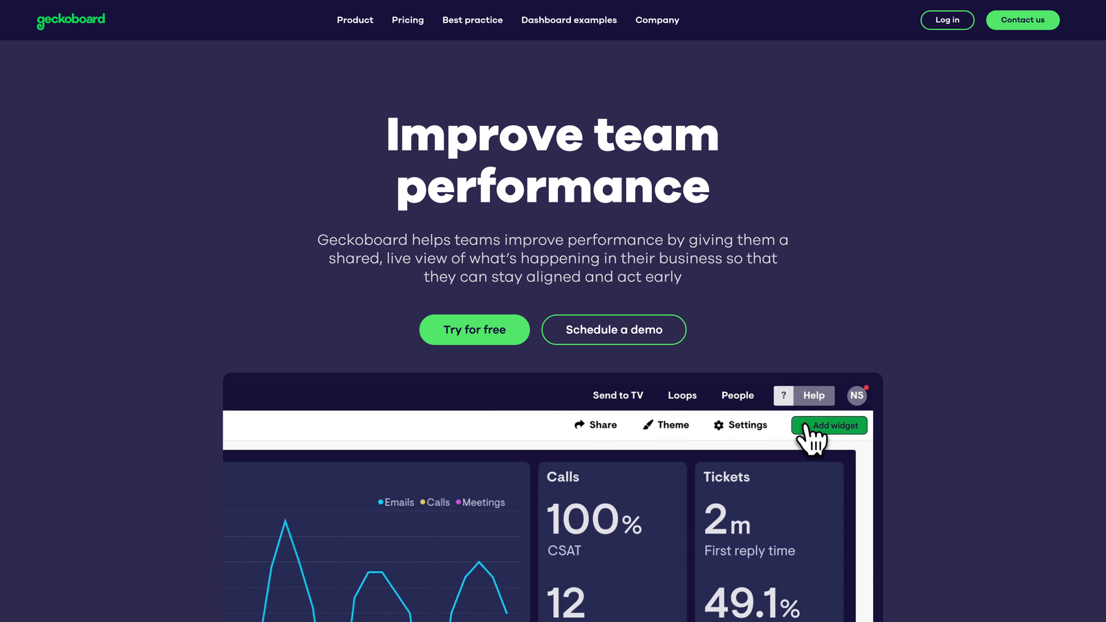
Where This Tool Shines
The TV dashboard mode transforms support metrics into something teams actually want to look at. Large, clear visualizations update in real-time, creating ambient awareness of team performance without anyone needing to log into a separate reporting tool. Support teams can see at a glance whether they're meeting SLA targets, how ticket volume compares to historical patterns, and which agents are crushing their goals.
Native integrations with Zendesk, Freshdesk, Intercom, and Help Scout mean you can start displaying metrics within minutes. The drag-and-drop widget builder requires no technical expertise, while status indicators and goal tracking add motivational elements that pure data dashboards lack.
Key Features
TV Display Mode: Optimized layouts for large screens with auto-rotation between multiple dashboard views.
Native Helpdesk Integrations: Direct connections to Zendesk, Freshdesk, Intercom, and Help Scout without middleware.
Drag-and-Drop Builder: Widget-based dashboard creation requiring no coding or technical configuration.
Goal Tracking: Visual indicators showing progress toward targets with color-coded status alerts.
Flexible Data Sources: Spreadsheet imports and API connections for combining support metrics with other business data.
Best For
Support teams that want metrics visible in their physical workspace, creating accountability and motivation through transparency. Works particularly well for co-located teams or offices with dedicated support areas.
Pricing
Starts at $39 per month for a single dashboard; additional dashboards available in higher-tier plans.
6. Klipfolio
Best for: Data-savvy teams needing advanced metric modeling and multi-source support analytics
Klipfolio provides enterprise-grade dashboard capabilities for teams that want complete control over data transformation and custom metric calculations.
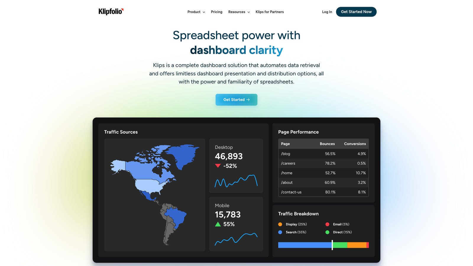
Where This Tool Shines
The advanced data modeling engine lets you combine support metrics from multiple sources, transform raw data into meaningful insights, and create custom calculations that match your unique business logic. You're not limited to pre-built metrics—if you can define the calculation, Klipfolio can visualize it.
White-label dashboard capabilities make this particularly valuable for agencies or support teams that report to clients. You can brand dashboards with client logos, customize color schemes, and share performance metrics that look professionally designed rather than generic tool outputs. PowerMetrics adds a metric catalog layer, creating a single source of truth for how your organization defines and measures support success.
Key Features
Advanced Data Modeling: Transform and combine data from multiple sources with custom formulas and calculations.
200+ Integrations: Pre-built connectors for major helpdesks, CRMs, and business tools plus API access.
Custom Metric Builder: Create calculated metrics using formulas that match your specific business logic.
White-Label Dashboards: Client-facing reports with custom branding, logos, and color schemes.
PowerMetrics Catalog: Centralized metric definitions ensuring consistent measurement across teams and dashboards.
Best For
Support operations teams with data analysis expertise who need dashboards that pull from multiple systems and apply complex business logic. Ideal for agencies reporting to clients or enterprises with custom KPI frameworks.
Pricing
Klipfolio dashboards start at $125 per month; PowerMetrics offers a free tier with paid plans for advanced features.
7. Databox
Best for: Mobile-first teams wanting automated scorecards and benchmark comparisons for support performance
Databox combines goal-focused dashboards with strong mobile accessibility, making support metrics available wherever team members work.
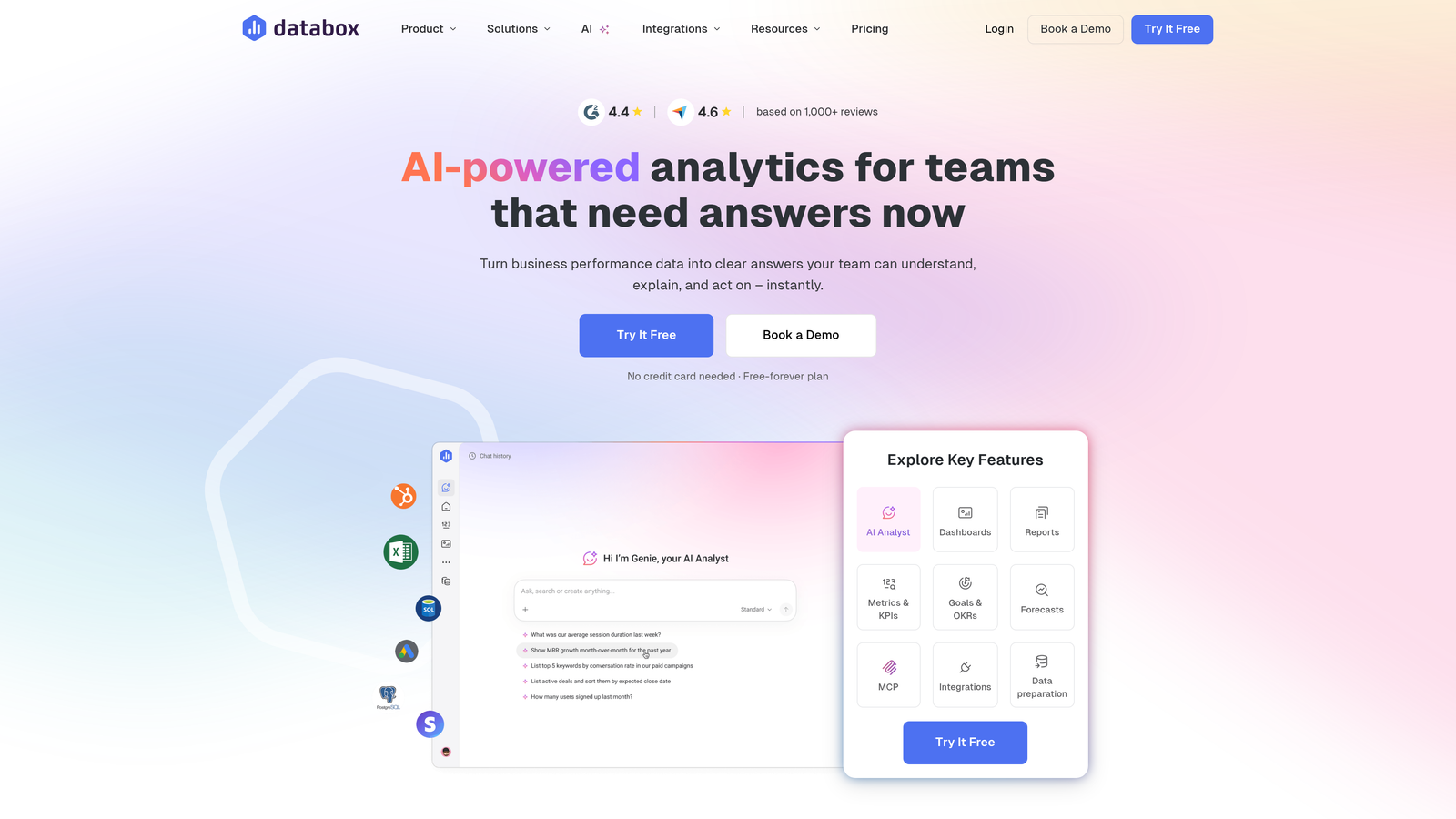
Where This Tool Shines
The mobile app delivers a genuinely useful dashboard experience on phones and tablets, not just a cramped version of desktop views. Support managers can check team performance during commutes, respond to alerts about SLA breaches, and review daily scorecards without opening a laptop.
Automated performance scorecards arrive daily or weekly, summarizing how your team performed against goals without requiring anyone to log in and check. Benchmark groups add competitive context—you can see how your resolution times or customer satisfaction scores compare to similar companies, identifying whether you're leading or lagging industry standards.
Key Features
Mobile Dashboard App: Native iOS and Android apps designed specifically for mobile viewing, not responsive web wrappers.
Automated Scorecards: Daily or weekly performance summaries delivered via email with key metric highlights.
Goal Tracking: Set targets for support metrics with automated alerts when performance deviates from goals.
Benchmark Groups: Anonymous comparison with similar companies to understand relative performance.
70+ Integrations: One-click connections to major helpdesks, analytics platforms, and business tools.
Best For
Distributed support teams or managers who need performance visibility on mobile devices. Particularly effective for leaders managing multiple locations or remote teams across time zones.
Pricing
Free tier available with basic features; paid plans start at $47 per month with additional data sources and users.
8. Metabase
Best for: Technical teams with database access wanting SQL-powered dashboards and self-hosted analytics
Metabase serves teams that store support data in their own databases and want complete control over analytics infrastructure.
Where This Tool Shines
Direct database connections bypass API limitations and data export delays. If your support platform stores data in PostgreSQL, MySQL, or another supported database, Metabase queries it directly—giving you access to every field, every record, and complete historical data without the constraints of third-party API rate limits.
The open-source model means you can self-host Metabase on your own infrastructure, maintaining complete data sovereignty. For teams with strict security or compliance requirements, this eliminates concerns about sending support data to external analytics platforms. The SQL query builder gives technical users full power, while the visual query interface lets non-technical team members explore data without writing code.
Key Features
Open-Source Foundation: Self-hosted deployment option with complete control over data and infrastructure.
Direct Database Access: Native connections to PostgreSQL, MySQL, MongoDB, and 20+ other databases.
Dual Query Interface: SQL editor for technical users plus visual query builder for business users.
Embedded Analytics: Embed dashboards directly into your product for customer-facing support metrics.
Automated Scheduling: Set up recurring report delivery via email or Slack with customizable frequency.
Best For
Engineering-led support teams that manage their own database infrastructure and want analytics without vendor lock-in. Especially valuable for companies with custom-built support platforms or strict data residency requirements.
Pricing
Open-source version free for self-hosting; Metabase Cloud starts at $85 per month with managed hosting and additional features.
9. Klaus + Looker Integration
Best for: Quality-focused teams combining conversation review analytics with advanced visualization for agent coaching
Klaus specializes in quality assurance for customer conversations, and when integrated with Looker's visualization capabilities, creates powerful dashboards for agent development.
Where This Tool Shines
Conversation review scoring goes beyond simple metrics like response time or resolution rate. Klaus evaluates the quality of support interactions—empathy, accuracy, tone, problem-solving approach—then tracks these qualitative measures over time. You can identify which agents excel at de-escalation, who needs coaching on product knowledge, and how quality scores correlate with customer satisfaction.
The Looker integration transforms Klaus's quality data into sophisticated visualizations that reveal patterns invisible in traditional support dashboards. Root cause analysis connects quality issues to specific products, conversation types, or customer segments, helping you address systemic problems rather than just coaching individual agents.
Key Features
Conversation Quality Scoring: Detailed evaluation of support interaction quality beyond efficiency metrics.
Agent Coaching Dashboards: Individual performance tracking with specific improvement areas and trend analysis.
Quality + Efficiency Metrics: Combined view showing how conversation quality correlates with resolution speed.
Looker Visualization: Advanced charts and analysis tools for exploring quality data across dimensions.
Root Cause Analysis: Identify systemic issues driving quality problems across products or conversation types.
Best For
Support organizations that prioritize conversation quality and agent development alongside traditional efficiency metrics. Works particularly well for teams with dedicated QA programs or those in regulated industries where interaction quality carries compliance implications.
Pricing
Klaus pricing available on request based on team size and review volume; Looker included with Google Cloud or available as standalone product.
Making the Right Choice
The best automated support reporting dashboard depends on where you are in your support evolution and what you're trying to optimize.
Choose Halo AI if you want AI-powered support operations with built-in business intelligence that learns from every interaction. The platform doesn't just report what happened—it connects support data to revenue outcomes, detects anomalies before they escalate, and powers the AI agents resolving tickets in real-time. This approach works best when you're scaling support without proportionally scaling headcount.
Stick with native analytics like Zendesk Explore or Freshdesk Analytics if you're already embedded in those ecosystems and want reporting that requires zero integration work. You'll get up and running faster, though you'll sacrifice the ability to combine support data with other business systems.
For dedicated dashboard tools that pull from multiple sources, Geckoboard offers the fastest path to TV-ready displays that motivate teams through visible metrics. Klipfolio provides deeper customization for teams with specific KPI frameworks or client reporting needs. Databox excels at mobile accessibility and automated scorecards for distributed teams.
Technical teams with database access will appreciate Metabase's flexibility and data sovereignty. Quality-focused organizations should explore Klaus combined with Looker for conversation analytics that inform agent coaching.
Whatever you choose, the goal remains the same: spend less time building reports and more time acting on insights that improve customer experience. The right dashboard doesn't just show you what happened—it reveals what to do next.
Your support team shouldn't scale linearly with your customer base. Let AI agents handle routine tickets, guide users through your product, and surface business intelligence while your team focuses on complex issues that need a human touch. See Halo in action and discover how continuous learning transforms every interaction into smarter, faster support.