9 Best Customer Support Analytics Dashboards in 2026
Support teams generate massive amounts of data from tickets, chats, and calls, but without the right customer support analytics dashboard, that information remains unusable. This guide evaluates nine leading analytics platforms in 2026 based on real-time visibility, customization capabilities, AI-powered insights, and integration options—helping you transform raw support interactions into actionable intelligence that identifies bottlenecks, reveals trends, and measures what truly drives customer satisfaction.
Support teams are drowning in data but starving for insights. Every ticket, chat, and call generates metrics—but without the right analytics dashboard, you're flying blind. The best customer support analytics dashboards transform raw interaction data into actionable intelligence: identifying bottlenecks before they become crises, spotting trends that inform product decisions, and measuring what actually matters for customer satisfaction.
We evaluated dozens of platforms based on real-time visibility, customization depth, AI-powered insights, and integration flexibility. Here are nine dashboards worth your attention in 2026.
1. Halo AI
Best for: Teams wanting AI-native analytics that connect support data to business outcomes
Halo AI isn't just another helpdesk with analytics bolted on—it's an AI-powered support platform with business intelligence built into its core architecture.
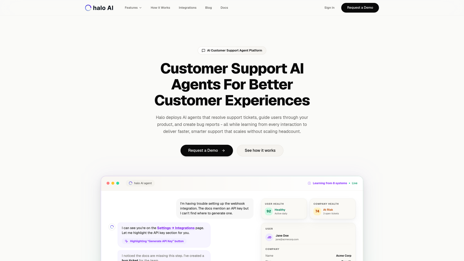
Where This Tool Shines
Halo stands apart by treating analytics as a strategic layer, not an afterthought. While traditional dashboards show you what happened, Halo's smart inbox surfaces why it matters—connecting support interactions to customer health, revenue signals, and product issues.
The platform tracks both AI agent and human performance in a unified view, making it particularly valuable for teams implementing automation. You'll see which interactions your AI agents handle successfully and where human escalation patterns emerge, helping you continuously improve your knowledge base and automation rules.
Key Features
Smart Inbox Analytics: Embedded dashboard that surfaces insights directly within your support workflow, eliminating context switching.
Customer Health Signals: Proactive identification of at-risk accounts based on support interaction patterns, sentiment shifts, and engagement changes.
Anomaly Detection: Automatic flagging of unusual patterns—sudden ticket spikes, sentiment drops, or emerging issue clusters—before they escalate.
Unified Performance Tracking: Monitor AI agent resolution rates alongside human metrics to understand your entire support operation's effectiveness.
Multi-System Intelligence: Connects support data with your broader business stack including Slack, HubSpot, Intercom, Stripe, Linear, and Zoom for comprehensive insights.
Best For
Product teams and support leaders who need analytics that go beyond traditional metrics. Particularly valuable for B2B companies implementing AI support agents and wanting visibility into both automation effectiveness and business impact. If you're tracking customer health, revenue intelligence, or trying to identify product issues from support patterns, Halo's approach makes these connections automatically.
Pricing
Contact for pricing. Halo's model focuses on value delivered rather than per-seat costs, making it attractive for teams scaling support without scaling headcount proportionally.
2. Zendesk Explore
Best for: Zendesk users needing native analytics without additional tool complexity
Zendesk Explore is the native analytics and reporting tool for the Zendesk ecosystem, offering pre-built dashboards and custom report capabilities.
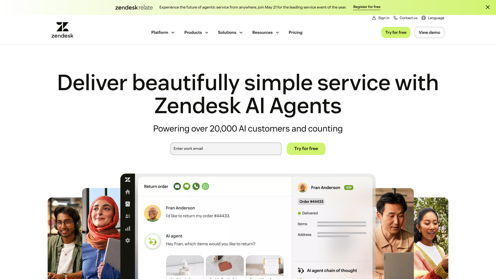
Where This Tool Shines
If you're already using Zendesk, Explore eliminates integration headaches entirely. The data flows automatically, and the pre-built dashboards cover the most common support metrics teams need: ticket volume, resolution times, agent performance, and customer satisfaction scores.
The drag-and-drop report builder makes customization accessible to non-technical users. You can slice data by channel, time period, team, or custom fields without writing SQL queries or learning complex BI tools.
Key Features
Pre-Built Dashboard Library: Ready-made dashboards for common scenarios like ticket backlog analysis, agent productivity, and CSAT tracking.
Custom Report Builder: Drag-and-drop interface for creating tailored reports without technical skills required.
Cross-Channel Analytics: Unified view across email, chat, phone, and social media interactions in one dashboard.
Team Performance Tracking: Monitor individual agent metrics and team-level trends with customizable performance indicators.
Scheduled Delivery: Automatically send reports to stakeholders on a recurring schedule, keeping everyone informed without manual work.
Best For
Teams already invested in the Zendesk ecosystem who want straightforward analytics without managing multiple tools. Works well for support leaders who need standard reporting and occasional custom analysis but don't require advanced business intelligence capabilities.
Pricing
Included with Zendesk Suite plans. Standalone pricing starts at $9 per agent per month, making it cost-effective for teams already using Zendesk.
3. Freshdesk Analytics
Best for: Freshdesk users wanting curated reports with minimal setup effort
Freshdesk Analytics provides built-in reporting capabilities with a curated library of pre-configured reports for common support scenarios.
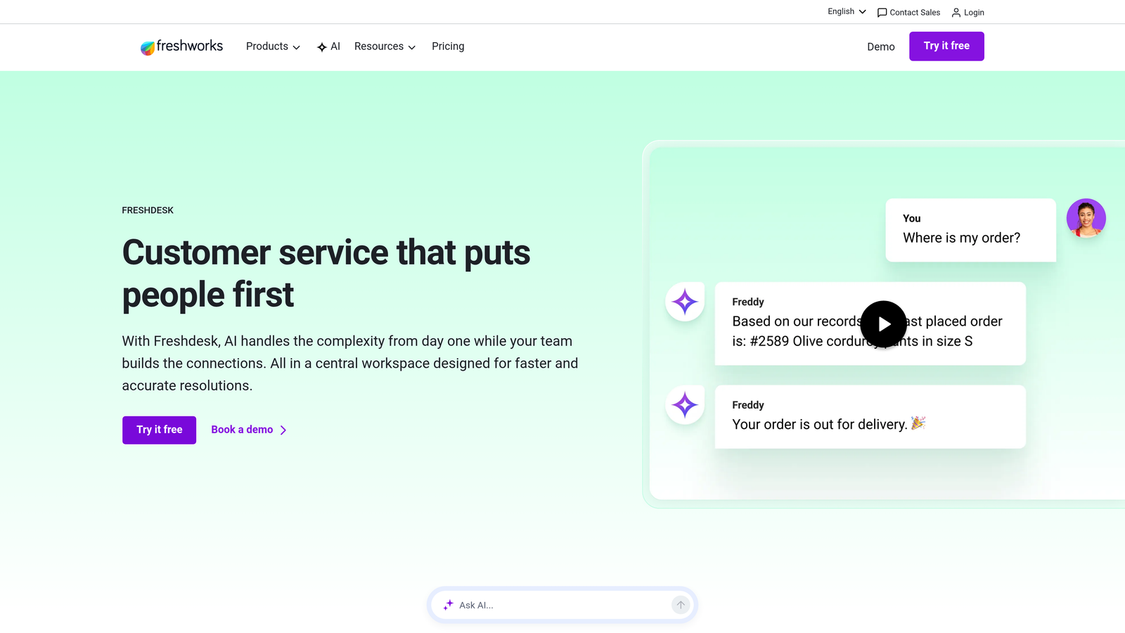
Where This Tool Shines
Freshdesk takes a curated approach to analytics, offering a library of pre-built reports that cover the metrics most support teams actually track. This means you can start getting value immediately without spending hours configuring dashboards.
The customizable widget system lets you build personalized dashboards by dragging relevant metrics into view. It's simpler than building reports from scratch but more flexible than being stuck with rigid templates.
Key Features
Curated Report Library: Pre-configured reports for ticket trends, agent productivity, customer satisfaction, and SLA compliance that work immediately.
Helpdesk Performance Metrics: Track first response time, resolution time, ticket backlog, and reopened tickets across your entire operation.
Agent Productivity Tracking: Monitor individual and team performance with metrics on tickets resolved, response times, and customer ratings.
Customer Satisfaction Analysis: Dedicated CSAT and NPS tracking with trend analysis over time.
Dashboard Widgets: Customizable widgets you can arrange to create personalized views for different roles and priorities.
Best For
Support teams using Freshdesk who want analytics that work out of the box with minimal configuration. Ideal for smaller teams or those without dedicated data analysts who still need comprehensive visibility into support operations.
Pricing
Basic analytics included with all Freshdesk plans. Advanced analytics features available in the Pro tier at $49 per agent per month.
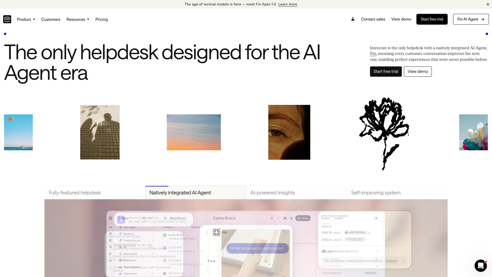
4. Intercom Reporting
Best for: Conversation-first teams using Intercom's messenger platform
Intercom Reporting provides analytics focused on conversation quality and team performance within Intercom's messenger-first support environment.
Where This Tool Shines
Intercom's analytics reflect its conversation-first philosophy. Rather than treating support as a ticketing system, it focuses on conversation quality, response patterns, and the effectiveness of both automated and human interactions.
The real-time nature of Intercom's reporting makes it particularly useful for teams that need immediate visibility. You can see conversation volume, response times, and teammate activity as it happens, not hours later when batch processes complete.
Key Features
Real-Time Performance Metrics: Live dashboard showing current conversation volume, response times, and team activity without delays.
Conversation Analytics: Track volume, duration, and resolution patterns across all conversation channels.
Bot vs. Human Resolution: Separate analytics for automated bot responses versus human agent interactions, helping you optimize automation.
Custom Report Builder: Create tailored reports focusing on the metrics most relevant to your team's goals.
Teammate Activity Monitoring: Individual performance tracking showing response times, conversation volume, and customer satisfaction by agent.
Best For
Teams already using Intercom's messenger platform who want analytics that match their conversation-first support model. Particularly valuable for companies implementing bot automation and needing clear visibility into what bots handle versus what requires human attention.
Pricing
Included with Intercom plans. Platform pricing starts at $74 per month, with reporting capabilities available across all tiers.
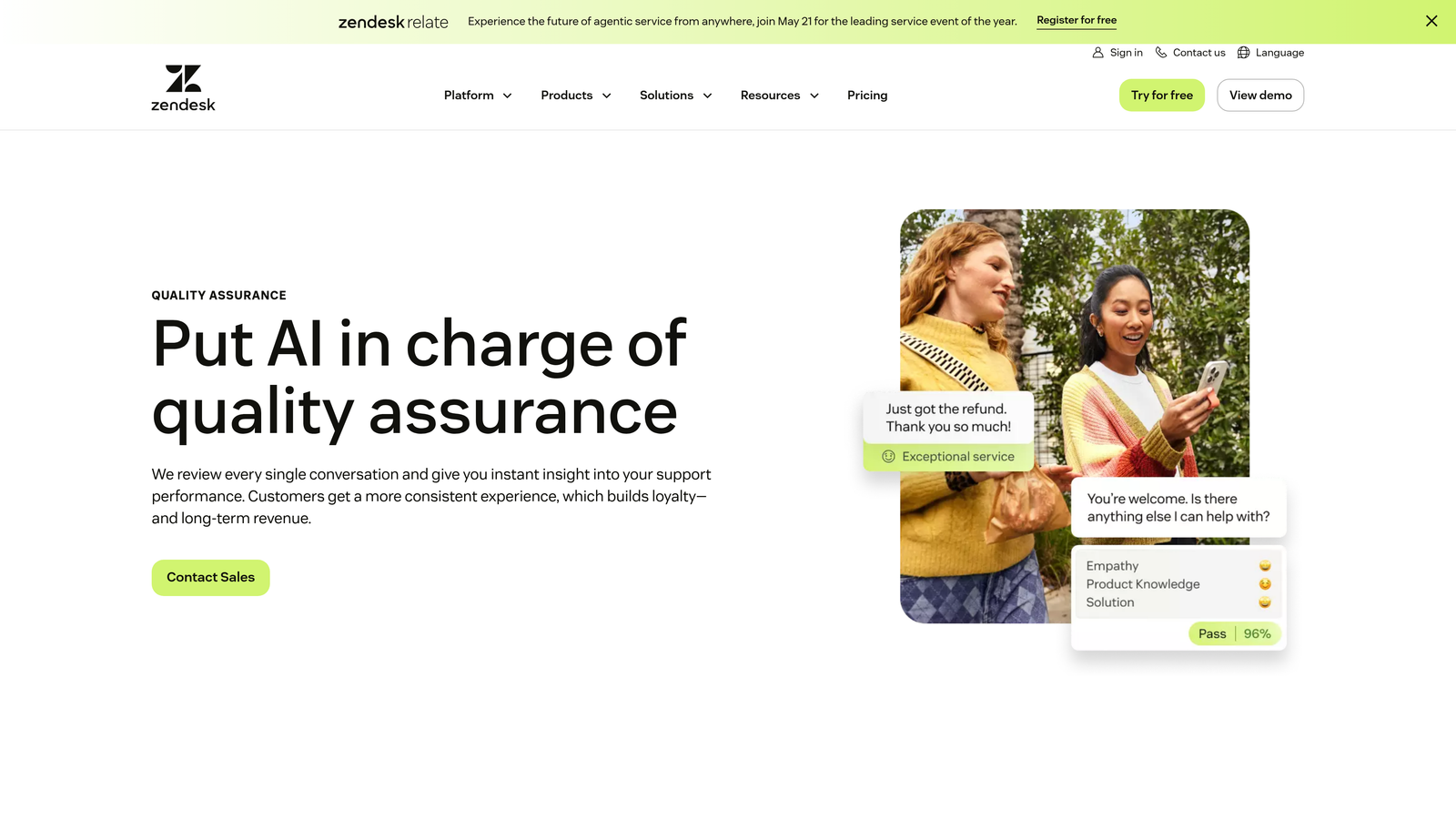
5. Klaus
Best for: Quality assurance and conversation review focused on improving support quality
Klaus is a specialized quality assurance platform that analyzes conversation quality and agent performance, now part of the Zendesk family.
Where This Tool Shines
Klaus approaches analytics from a quality-first perspective. Instead of just counting tickets resolved, it helps you understand how well they were resolved through systematic conversation review and scoring.
The AI-powered quality insights identify patterns in conversation quality that traditional metrics miss—things like tone consistency, solution accuracy, and adherence to brand voice. This makes it invaluable for teams where quality matters as much as speed.
Key Features
Conversation Review System: Structured framework for reviewing and scoring support conversations against your quality standards.
AI-Powered Quality Insights: Automated analysis identifying quality patterns, common issues, and coaching opportunities across your team.
Agent Coaching Dashboards: Individual performance views highlighting strengths and areas for improvement with specific conversation examples.
Root Cause Analysis: Identify systemic issues causing quality problems rather than just tracking symptoms.
Calibration Sessions: Tools for ensuring consistent scoring across reviewers, maintaining fair and accurate quality assessments.
Best For
Support leaders prioritizing quality over pure speed metrics. Particularly valuable for teams with complex products, high-touch customers, or strict compliance requirements where conversation quality significantly impacts business outcomes.
Pricing
Contact for pricing. Typically starts around $15 per user per month, with pricing scaling based on conversation volume and features needed.
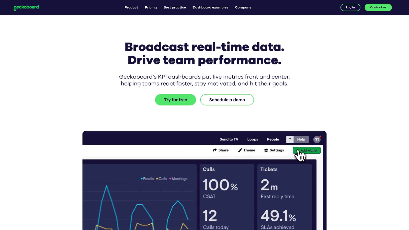
6. Geckoboard
Best for: Real-time TV displays and live team visibility dashboards
Geckoboard is a real-time dashboard tool specifically designed for TV displays and creating live visibility for support teams.
Where This Tool Shines
Geckoboard excels at one thing: making your metrics impossible to ignore. The TV-optimized display mode turns any monitor into a live dashboard that keeps your entire team aligned on current performance.
The real-time updates mean everyone sees the same current reality—ticket backlogs, response times, SLA compliance—without needing to open another tool. This shared visibility creates natural accountability and helps teams self-organize around emerging issues.
Key Features
TV-Optimized Display Mode: Purpose-built interface designed for large screens and distance viewing with high-contrast visualizations.
Real-Time Data Updates: Live metric refreshes showing current state, not outdated snapshots from hours ago.
60+ Integrations: Connect to Zendesk, Freshdesk, Intercom, and dozens of other tools your support team uses.
Drag-and-Drop Builder: Create custom dashboards by dragging metrics into place without technical configuration.
Status Indicators: Visual goal tracking with red/yellow/green indicators showing whether you're hitting targets.
Best For
Teams wanting shared visibility through office displays or remote dashboard sharing. Particularly effective for creating team accountability and making performance metrics part of your daily culture rather than monthly review meetings.
Pricing
Starts at $49 per month for one dashboard. Additional dashboards available in higher tiers, with unlimited dashboards at $949 per month.
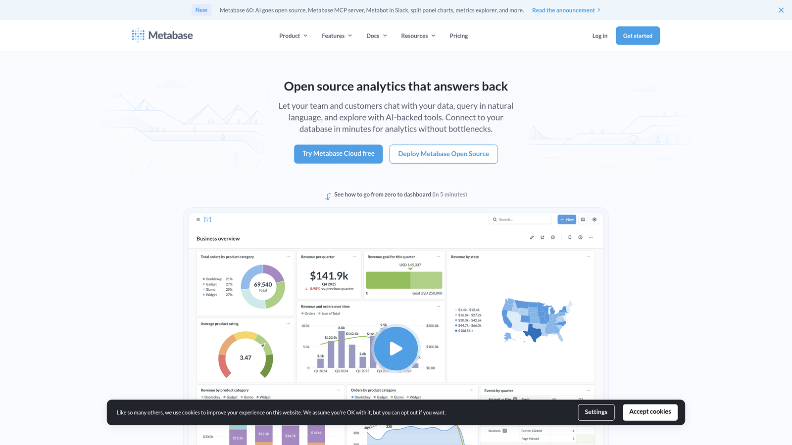
7. Metabase
Best for: Technical teams wanting complete control through open-source flexibility
Metabase is an open-source business intelligence tool that lets you build custom analytics by connecting directly to your databases.
Where This Tool Shines
Metabase gives you complete control. You're not limited to pre-built reports or constrained by what a vendor thinks you should track. Connect directly to your database and build exactly the analytics you need.
The open-source model means you can self-host, customize the codebase, and avoid vendor lock-in entirely. For teams with technical resources, this flexibility outweighs the convenience of pre-built solutions.
Key Features
Open-Source Foundation: Self-hosted option with full access to source code for customization and control.
Direct Database Connection: Query your support database directly rather than relying on API limitations or data exports.
Custom SQL Queries: Write sophisticated queries to analyze support data exactly how you need, without tool limitations.
Embeddable Dashboards: Share dashboards with stakeholders or embed them in other tools and internal applications.
No-Code Question Builder: Visual query builder for non-technical users to explore data without writing SQL.
Best For
Technical teams with database access and specific analytics requirements that pre-built solutions don't address. Ideal for companies wanting to combine support data with custom application data, product usage metrics, or other internal systems.
Pricing
Free for the open-source version with self-hosting. Pro plan starts at $85 per month for cloud hosting with additional features like audit logs and advanced permissions.
8. Looker (Google Cloud)
Best for: Enterprise teams needing consistent metrics across departments and complex data modeling
Looker is Google Cloud's enterprise-grade business intelligence platform with semantic modeling capabilities for consistent cross-team analytics.
Where This Tool Shines
Looker's semantic layer solves a problem most analytics tools ignore: metric consistency across teams. When support, product, and finance all define "customer churn" differently, you get conflicting reports and wasted meetings.
The LookML modeling language creates a single source of truth. Define metrics once, use them everywhere. This enterprise-grade approach makes Looker worth the complexity for large organizations where data governance matters.
Key Features
LookML Semantic Layer: Define business logic and metrics once, ensuring consistent calculations across all reports and teams.
Cross-Departmental Modeling: Build data models that connect support metrics with sales, product, and finance data for holistic insights.
Embedded Analytics: White-label and embed dashboards in customer-facing applications or internal tools.
Git-Based Version Control: Track changes to data models and reports with full version history and collaboration workflows.
Advanced Data Governance: Enterprise-grade permissions, audit trails, and data access controls for compliance requirements.
Best For
Large enterprises with complex data environments, multiple teams using support data, and strict governance requirements. The investment makes sense when metric consistency and cross-departmental analytics justify the implementation complexity.
Pricing
Contact Google Cloud for enterprise pricing. Typically starts around $5,000 per month for mid-sized deployments, scaling significantly for large organizations.
9. Klipfolio
Best for: Agencies and multi-client operations needing white-label dashboard capabilities
Klipfolio is a dashboard platform with extensive data source connections and white-label options ideal for agencies managing multiple clients.
Where This Tool Shines
Klipfolio's white-label capabilities make it uniquely valuable for agencies. You can create branded dashboards for each client, maintaining your agency's look and feel while providing customized analytics.
The 150+ data source connectors mean you can pull support data from virtually any platform your clients use, creating unified dashboards even when clients have different tech stacks.
Key Features
150+ Data Connectors: Pre-built integrations with most support platforms plus custom API connections for proprietary systems.
White-Label Branding: Apply your agency's branding to dashboards, removing Klipfolio branding for client-facing reports.
PowerMetrics Platform: Separate product focused on metric tracking and goal management across teams.
Automated Data Refresh: Schedule automatic updates so dashboards always show current data without manual intervention.
Client Dashboard Sharing: Secure sharing options with granular permissions for client access to their specific dashboards.
Best For
Agencies managing support operations for multiple clients, or companies with complex multi-brand operations needing separate dashboards. The white-label capabilities and broad integration support justify the cost when managing diverse client tech stacks.
Pricing
Klipfolio starts at $90 per month for basic dashboards. PowerMetrics platform starts at $142 per month. Enterprise pricing available for agencies with multiple clients.
Making the Right Choice
Your ideal customer support analytics dashboard depends on your stack and priorities.
For AI-native teams wanting analytics that go beyond traditional metrics—including customer health signals and revenue intelligence—Halo AI offers a fundamentally different approach. The platform connects support interactions to business outcomes rather than just tracking ticket counts.
Zendesk and Freshdesk users will find their native analytics tools sufficient for standard reporting. The integration is seamless, and you avoid adding complexity to your stack. Teams prioritizing quality assurance should explore Klaus, while those needing real-time office displays will appreciate Geckoboard's simplicity.
Technical teams wanting complete customization can build exactly what they need with Metabase or Looker. Metabase works well for mid-sized teams with technical resources, while Looker makes sense for enterprises needing consistent metrics across departments.
Start with your primary use case: Are you tracking agent performance, identifying product issues, or measuring customer satisfaction? The right dashboard makes that data instantly accessible—not buried in spreadsheets.
Your support team shouldn't scale linearly with your customer base. Let AI agents handle routine tickets, guide users through your product, and surface business intelligence while your team focuses on complex issues that need a human touch. See Halo in action and discover how continuous learning transforms every interaction into smarter, faster support.