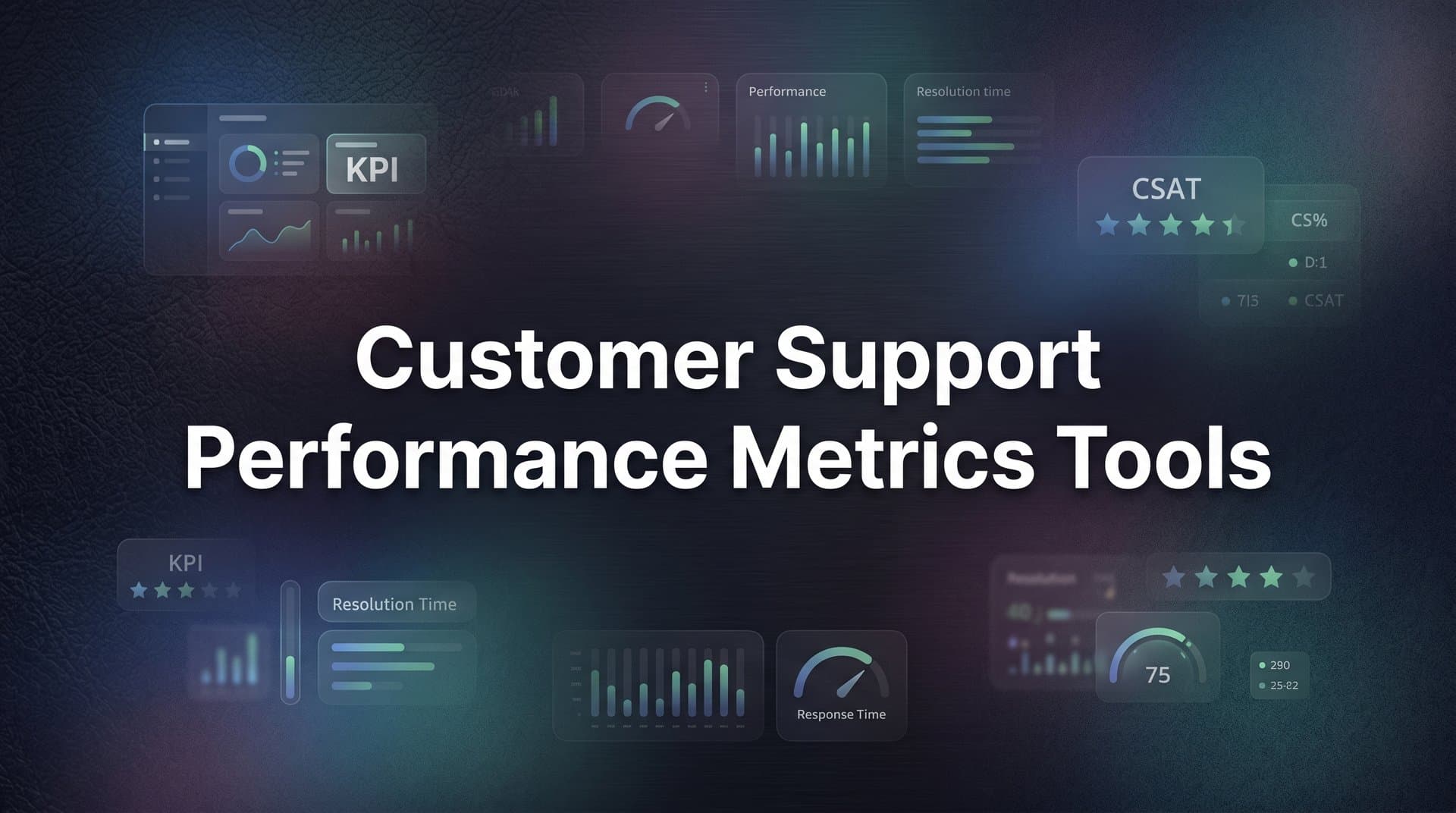
9 Best Customer Support Performance Metrics Tools in 2026
Choosing the right customer support performance metrics tools means moving beyond basic dashboards to platforms that reveal ticket trends, agent struggles, and customer sentiment in real time. This guide evaluates nine leading solutions—from AI-native analytics platforms to BI layers built on existing helpdesks—helping support teams of all sizes find the right fit for tracking, understanding, and improving performance outcomes.
If you can't measure it, you can't improve it — and in customer support, the gap between guessing and knowing can cost you customers. The right metrics tools don't just surface numbers; they reveal why tickets spike, where agents struggle, which issues recur, and what customers actually feel.
The market has evolved well beyond basic dashboards. Today's best tools combine real-time analytics, AI-driven insights, sentiment analysis, and business intelligence that connects support data to revenue outcomes. This list covers tools purpose-built (or well-suited) for tracking customer support performance metrics: from AI-native platforms that learn from every interaction to specialized analytics layers that sit on top of your existing helpdesk.
Whether you're running a lean support team that needs automation-driven intelligence or a larger operation looking for deep reporting, there's a right fit here. Each tool has been evaluated on depth of metrics coverage, ease of use, integration flexibility, and how well it surfaces actionable insight — not just data.
1. Halo AI
Best for: Teams that want metrics intelligence embedded directly in their AI support workflow
Halo AI is an AI-native customer support platform where analytics are built into the resolution workflow itself, not bolted on afterward.
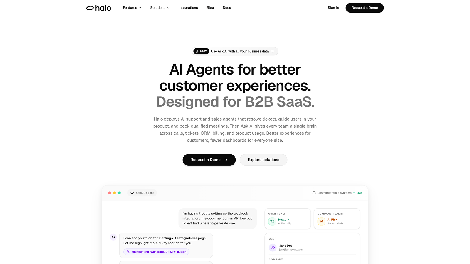
Where This Tool Shines
Most analytics tools require you to go looking for insight. Halo's Smart Inbox flips that dynamic by proactively surfacing customer health signals, revenue anomalies, and recurring issue patterns as part of how your team works every day. You're not running reports after the fact; the intelligence is already there when you need it.
What makes this particularly useful is the page-aware context layer. Halo's AI sees what users see when they reach out, which means quantitative metrics like ticket volume and response time are accompanied by qualitative signal about what users were actually experiencing. That combination makes it far easier to diagnose root causes rather than just observe symptoms.
Key Features
Smart Inbox with Business Intelligence: Surfaces customer health signals, revenue anomalies, and recurring issue patterns alongside standard support metrics — all in one view.
Page-Aware Context: The AI understands what users are experiencing when they contact support, adding qualitative signal to your quantitative data.
Auto Bug Ticket Creation: Automatically tracks and routes engineering-relevant issues so you're measuring product problems, not just support volume.
AI and Live Agent Performance Tracking: Monitor AI agent resolution rates alongside human agent metrics in a unified view.
Cross-Functional Integrations: Connects with Linear, Slack, HubSpot, Stripe, Zoom, PandaDoc, and Fathom — bringing support data into the broader business context.
Best For
B2B SaaS teams and product-led companies that want their support metrics to inform more than just the support team. Particularly strong for organizations where customer health and revenue intelligence matter as much as ticket resolution speed.
Pricing
Contact for pricing via haloagents.ai. Pricing is customized based on team size and use case.
2. Zendesk Explore
Best for: Teams already operating within the Zendesk ecosystem who need robust native analytics
Zendesk Explore is Zendesk's native analytics product, offering pre-built dashboards and a custom query builder for deep reporting within the Zendesk Suite.
Where This Tool Shines
If your team lives in Zendesk, Explore is the natural starting point for analytics. It covers the core metrics support leaders care about — CSAT, first response time, resolution time, SLA compliance — without requiring any data exports or third-party connections. Everything is already connected.
The Explore Query Language (EQL) gives more analytically inclined users the ability to build custom reports that go well beyond the pre-built dashboards. It's not as flexible as a full BI tool, but for most Zendesk-centric teams, it covers the majority of reporting needs without significant setup overhead.
Key Features
Pre-Built Dashboards: Ready-to-use views for CSAT, first response time, resolution time, and SLA compliance — no configuration needed.
Custom Query Builder (EQL): Build tailored reports using Zendesk's proprietary query language for more granular analysis.
Drill-Down Filtering: Segment data by agent, channel, ticket tag, and time period to identify specific performance patterns.
Scheduled Report Delivery: Automate report distribution to stakeholders on a set cadence.
Native Suite Integration: Seamlessly connects with all Zendesk Suite products — no API work required.
Best For
Support teams already committed to Zendesk who want solid reporting without adding another tool to their stack. Less suited for organizations using multiple helpdesks or needing cross-platform data consolidation.
Pricing
Included in Zendesk Suite plans; Explore Professional and Enterprise tiers are available for teams needing more advanced reporting capabilities.
3. Freshdesk Analytics
Best for: Freshdesk users who need ticket lifecycle and agent performance reporting without leaving the platform
Freshdesk Analytics is Freshdesk's built-in reporting suite, covering ticket trends, agent performance, SLA tracking, and CSAT with both pre-built and custom report options.
Where This Tool Shines
Freshdesk Analytics earns its place by being genuinely accessible. The canned reports cover the most common support metrics out of the box, meaning teams can get meaningful visibility into their performance without any configuration. For support managers who don't have time to build custom dashboards, this is a significant practical advantage.
The custom report builder adds flexibility for teams that want to go deeper, allowing metric combinations that aren't available in the standard views. SLA breach alerts are particularly useful for teams with contractual response commitments, giving managers early warning before a breach becomes a problem.
Key Features
Canned Reports: Pre-built views for ticket volume, response times, and agent performance — ready to use immediately.
Custom Report Builder: Combine metrics in tailored configurations to match your team's specific reporting needs.
SLA Compliance Tracking: Monitor SLA adherence and receive breach alerts before commitments are missed.
CSAT Reporting: Track customer satisfaction scores with trend analysis over time.
Scheduled Exports: Automate report delivery and share dashboards with stakeholders on a regular cadence.
Best For
Freshdesk users at any team size who want solid, no-friction reporting on standard support metrics. Teams that have outgrown native reporting and need cross-platform data may need to supplement with a BI tool.
Pricing
Included in Freshdesk plans; advanced analytics features are available on the Growth plan and above.
4. Intercom Reports
Best for: Teams using Intercom's Fin AI alongside human agents who need unified AI and human performance tracking
Intercom Reports is Intercom's native reporting suite, with particular strength in tracking AI resolution rates alongside human agent performance in a single view.

Where This Tool Shines
As AI agents handle an increasing share of customer conversations, the ability to see AI performance alongside human performance becomes genuinely important — not just a nice-to-have. Intercom Reports does this well, showing the ratio of Fin AI-resolved conversations versus human-handled ones, which helps teams understand where automation is working and where it needs improvement.
The conversation tagging and topic trend analysis features add a layer of qualitative understanding to the volume and speed metrics. Instead of just knowing how many conversations came in, you can see what those conversations were about and how those topics trend over time.
Key Features
AI Resolution Rate Tracking: Monitor Fin AI vs. human-handled conversation ratios side-by-side to evaluate automation effectiveness.
Conversation CSAT and Response Times: Standard satisfaction and speed metrics tracked at the conversation level.
Teammate Performance Reports: Workload distribution and individual agent performance in a unified view.
Channel-Level Breakdown: Segment metrics by chat, email, and in-app channels.
Topic Trend Analysis: Conversation tagging and trend tracking to understand what customers are asking about over time.
Best For
Teams using Intercom as their primary support platform, especially those leveraging Fin AI who want to measure automation impact alongside traditional support metrics.
Pricing
Included in Intercom plans; advanced reporting features are available on higher-tier subscriptions.
5. Klaus (Zendesk QA)
Best for: Teams that want AI-powered quality assurance scoring across 100% of conversations, not just sampled reviews
Klaus is a conversation quality assurance tool, acquired by Zendesk, that uses AI to auto-score every support conversation against custom rubrics — replacing manual sampling with full-coverage coaching metrics.
Where This Tool Shines
Traditional QA involves a reviewer manually scoring a small sample of conversations — maybe 2-5 per agent per week. Klaus changes the math entirely by using AI to score every single conversation automatically. This means you're not making coaching decisions based on a narrow slice of activity; you're working from a complete picture.
The connection between quality scores and CSAT outcomes is where Klaus gets particularly interesting. Rather than treating QA as a compliance exercise, it helps managers identify which quality dimensions actually correlate with customer satisfaction — and prioritize coaching accordingly.
Key Features
AI Auto-Scoring: Score 100% of conversations against custom QA rubrics without manual reviewer time.
QA-to-CSAT Correlation: Connect quality scores to customer satisfaction outcomes to identify what coaching actually moves the needle.
Calibration Tools: Ensure consistent scoring standards across multiple reviewers and teams.
Agent Coaching Dashboards: Track individual agent quality trends over time to guide development conversations.
Multi-Platform Support: Works across Zendesk, Intercom, Salesforce, and other helpdesks.
Best For
Support teams with dedicated QA programs, team leads who want data-driven coaching conversations, and organizations where conversation quality directly impacts customer retention.
Pricing
Available as a separate add-on; contact Zendesk directly for current pricing details.
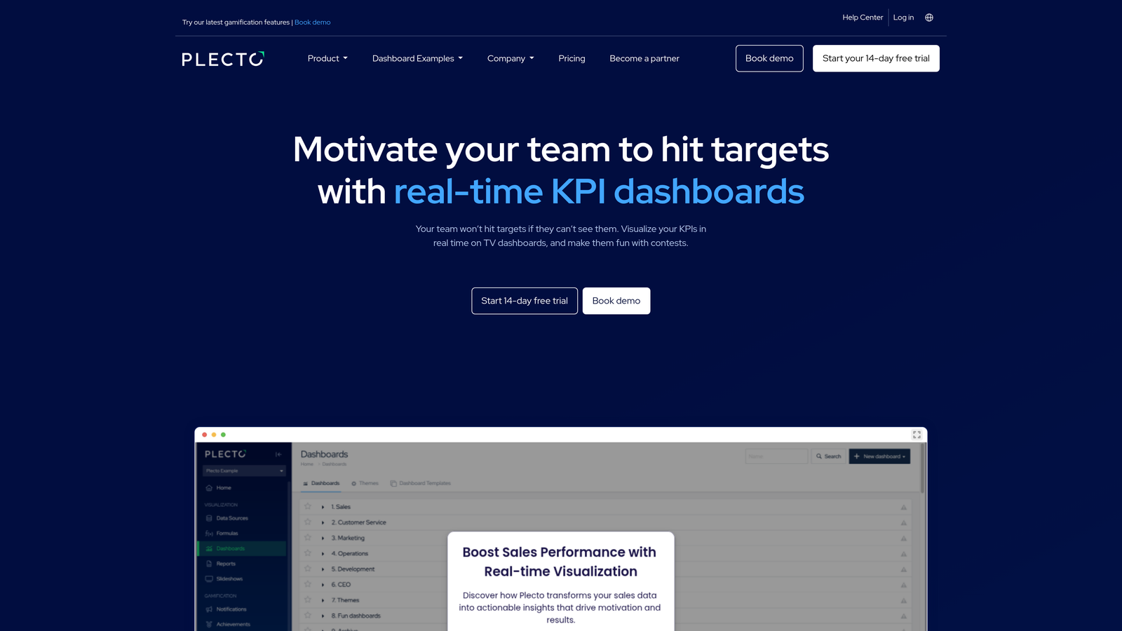
6. Plecto
Best for: Team leads who want real-time KPI visibility combined with gamification features to drive agent engagement
Plecto is a real-time performance dashboard platform that connects to helpdesks and CRMs to display live support KPIs, with built-in gamification designed to motivate agents alongside tracking their performance.
Where This Tool Shines
Plecto occupies an interesting niche: it's not just about measuring performance, it's about displaying it in a way that motivates teams. Live leaderboards, achievement badges, and contest features create a layer of engagement on top of standard KPI tracking that purely analytical tools don't offer. For support teams where morale and motivation are as important as measurement, this distinction matters.
The real-time dashboard capability — designed for TV displays in shared workspaces as well as Slack and Teams — makes performance visible to everyone on the floor simultaneously. This kind of ambient visibility can shift team culture around metrics in ways that monthly reports simply can't.
Key Features
Real-Time KPI Dashboards: Live metric displays optimized for TV screens, Slack, and Microsoft Teams.
Gamification Features: Leaderboards, achievement systems, and team contests to drive engagement alongside performance tracking.
Wide Integration Library: Connects to Zendesk, Freshdesk, Salesforce, and over 100 additional data sources.
Formula Builder: Create custom metric calculations beyond what native integrations provide.
Individual and Team Trend Tracking: Monitor performance patterns over time at both the individual and team level.
Best For
Support team leads and managers in environments where team culture and motivation are active priorities, particularly in office settings where shared displays can create real-time performance visibility.
Pricing
Starts at approximately $200/month for small teams; scales based on the number of users and connected data sources.
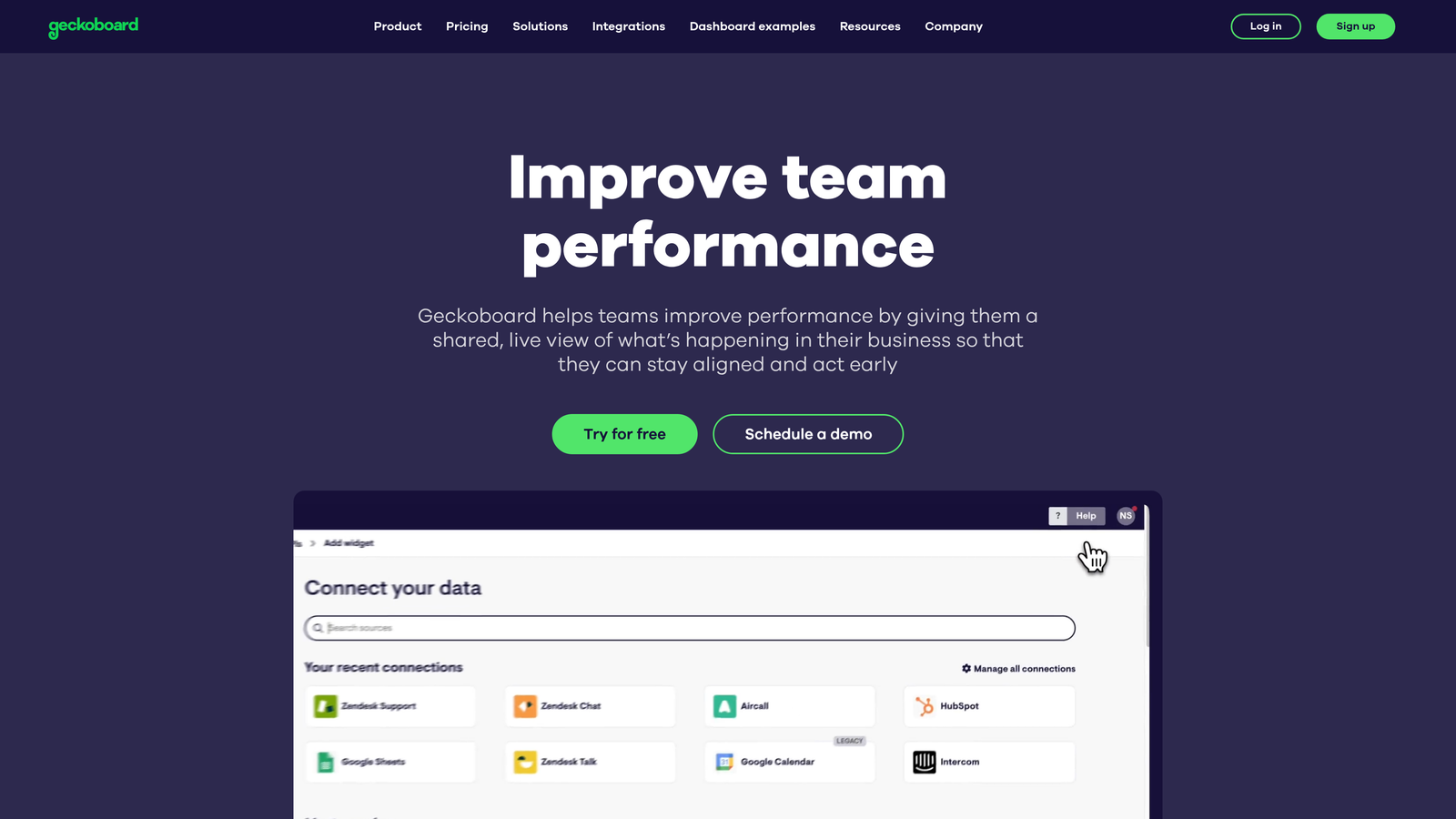
7. Geckoboard
Best for: Small teams that need clean, shareable KPI dashboards with minimal setup time
Geckoboard is a lightweight, no-code KPI dashboard tool that pulls data from multiple support platforms into clean, shareable displays — built for simplicity over analytical depth.
Where This Tool Shines
Geckoboard's defining characteristic is how quickly you can go from zero to a working dashboard. For small support teams that need visibility without a dedicated analyst or lengthy implementation, this matters enormously. The no-code builder and pre-built integrations mean you're typically looking at hours of setup, not weeks.
The shareable dashboard links are a particularly practical feature. Stakeholders who don't need a full platform login can view live metrics via a link — useful for keeping leadership informed without adding seats or managing access permissions across multiple tools.
Key Features
No-Code Dashboard Builder: Pre-built integrations for Zendesk, Freshdesk, and other common platforms with no technical configuration required.
Clean Visual Displays: Optimized for TV dashboards and remote team sharing with a focus on readability.
Real-Time Data Refresh: Live metric updates for current performance visibility throughout the day.
Shareable Dashboard Links: Share live dashboards with stakeholders who don't need platform logins.
Fast Setup: Most teams are operational within an hour of starting configuration.
Best For
Small support teams, startups, and team leads who need quick, clean KPI visibility without the complexity of a full BI platform. Less suited for teams needing deep analytical flexibility or multi-source data joins.
Pricing
Starts at approximately $49/month; scales based on the number of dashboards and connected data sources.
8. Medallia
Best for: Large enterprises with dedicated CX programs that need to connect support metrics with NPS, journey analytics, and unstructured feedback at scale
Medallia is an enterprise experience management platform that combines operational support metrics with NPS, customer journey analytics, and AI-powered text and speech analysis.
Where This Tool Shines
Medallia's differentiation is breadth. Where most tools focus on what happened in a support interaction, Medallia connects that data to the full customer journey — including survey responses, NPS signals, and unstructured feedback from calls and text. For enterprise CX teams, this cross-channel view is often the missing piece in understanding why customers churn or escalate.
The closed-loop action management feature is notable: when a customer registers as a detractor, Medallia enables structured follow-up workflows to address the issue. This moves the platform from passive measurement into active experience recovery, which is a meaningful distinction for organizations where customer retention is a board-level priority.
Key Features
Cross-Channel Experience Data: Unifies support metrics, NPS, survey data, and journey analytics in a single platform.
AI Text and Speech Analytics: Analyzes unstructured feedback from calls and text at scale to surface themes and sentiment.
Role-Based Dashboards: Tailored views for frontline agents, team managers, and executive leadership.
Closed-Loop Action Management: Structured workflows for following up with detractors and at-risk customers.
Enterprise Security and Compliance: Built for large organizations with strict data governance requirements.
Best For
Enterprise organizations with dedicated CX programs, significant support volume, and the budget and implementation resources to match. Not suited for SMB teams or organizations without a clear CX strategy.
Pricing
Enterprise pricing with significant implementation investment; contact Medallia directly for a quote tailored to your organization's scale.
9. Tableau
Best for: Data-mature teams that need to join support metrics with CRM, revenue, or product usage data in fully custom dashboards
Tableau is Salesforce's industry-leading BI platform, offering unlimited flexibility for custom support analytics — ideal for organizations that have outgrown native helpdesk reporting.
Where This Tool Shines
Tableau's superpower is its ability to connect and join data from virtually any source. For support teams that want to understand the relationship between ticket volume and churn risk, or between response time and expansion revenue, Tableau makes those cross-functional analyses possible in ways that native helpdesk tools simply cannot. If the question involves support data plus anything else, Tableau can answer it.
The trade-off is clear: this flexibility requires investment. Setting up Tableau for meaningful support analytics typically requires someone with data skills — either an in-house analyst or a dedicated implementation resource. For teams with that capability, the ceiling is essentially unlimited. For teams without it, the tool's potential often goes unrealized.
Key Features
Universal Data Connectivity: Connect to any helpdesk via native connectors or direct database access — no source is off-limits.
Custom Metric Modeling: Build any metric combination your team needs, unconstrained by pre-built report templates.
Cross-Functional Data Joins: Combine support data with Salesforce CRM, product analytics, or financial data in unified dashboards.
Advanced Visualization: Complex reporting needs are matched by equally sophisticated visualization options.
Stakeholder Distribution: Shared dashboards and scheduled data extracts for organization-wide reporting.
Best For
Organizations with in-house data or analytics teams, particularly those already using Salesforce, where support metrics need to be analyzed alongside CRM and revenue data for strategic decision-making.
Pricing
Tableau Creator starts at $75/user/month billed annually; Viewer licenses are available at a lower cost for stakeholders who only need to consume reports.
Which Tool Is Right for Your Team?
The right customer support metrics tool depends less on feature lists and more on where your team is today and where you're trying to go. Here's a quick way to think through the options.
If you're already on Zendesk or Freshdesk: Start with the native analytics tools — Zendesk Explore or Freshdesk Analytics. They cover the core metrics without adding complexity, and you can always layer in a specialized tool later if you hit their limits.
If you use Intercom and have AI in your support workflow: Intercom Reports is the natural fit, particularly for tracking how Fin AI is performing relative to your human team. The AI-vs-human resolution tracking alone justifies staying native before exploring third-party options.
If conversation quality and coaching are your priority: Klaus (Zendesk QA) fills a gap that volume and speed metrics can't. Auto-scoring every conversation gives you a coaching foundation that sampled manual reviews simply can't provide.
If you need live dashboards your whole team can see: Plecto and Geckoboard serve different ends of the same need. Geckoboard is faster to set up and more affordable; Plecto adds gamification and broader data source connectivity for teams where agent engagement is part of the strategy.
If you're at enterprise scale with a full CX program: Medallia or Tableau are the tools built for that scope. Medallia excels when you need to connect support metrics to the full customer journey; Tableau excels when you need support data joined with CRM and revenue data in fully custom analyses.
If you want metrics intelligence built into your AI support workflow from the start: Halo AI is the option worth exploring. Rather than adding a reporting layer on top of your existing helpdesk, Halo embeds business intelligence directly into how support gets done — surfacing customer health signals, anomaly detection, and revenue intelligence alongside ticket resolution. Your support team shouldn't scale linearly with your customer base. See Halo in action and discover how continuous learning transforms every interaction into smarter, faster support.