9 Best Support Analytics Dashboard Tools in 2026
Choosing the right support analytics dashboard tools in 2026 means going beyond basic ticket tracking to platforms that reveal why issues recur, flag agent burnout risks, and surface churn signals from support data. This guide evaluates nine leading tools on integrations, AI capabilities, reporting quality, and pricing to help support teams make smarter, faster decisions.
Your support team closes tickets. But do you know which issues keep coming back, which agents are approaching burnout, or where customers silently churn before ever reaching out? Support analytics dashboards answer those questions, turning raw ticket data into decisions that actually improve customer experience and team performance.
The market has matured considerably. You're no longer choosing between "has a dashboard" and "doesn't have a dashboard." The real distinction now is between tools that count what happened versus tools that help you understand why it happened and what to do next. Some platforms go even further, surfacing business intelligence signals like customer health and churn risk directly from support interactions.
Here are the top support analytics dashboard tools available in 2026, evaluated on native integrations, out-of-the-box reporting quality, AI capabilities, scalability, and pricing transparency.
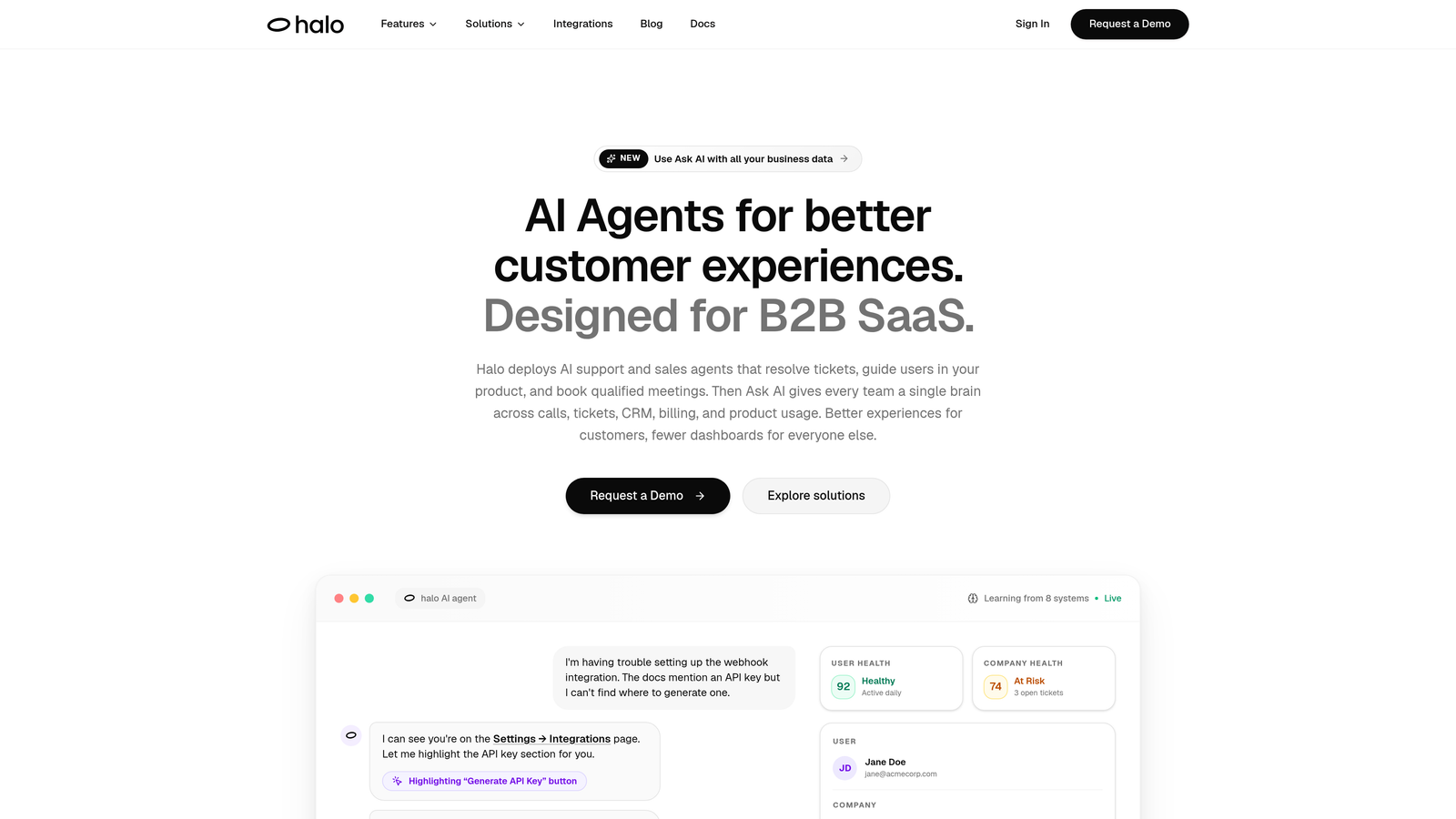
1. Halo AI
Best for: Teams that want business intelligence embedded in their support workflow, not bolted on separately.
Halo AI is an AI-native customer support platform where analytics are a built-in layer of the agent experience, not a separate reporting module.
Where This Tool Shines
Most support analytics tools tell you what happened after the fact. Halo's Smart Inbox surfaces intelligence while your team is working, flagging churn risk patterns, customer health signals, and revenue context in real time. It's the difference between a rearview mirror and a heads-up display.
The page-aware context is a genuine differentiator. Because Halo's AI sees what users see during interactions, the analytics carry qualitative depth that purely quantitative tools miss. A ticket spike isn't just a number — it's tied to a specific product page, a specific user journey, and a specific pattern the system has already started connecting to other signals across your stack.
Key Features
Smart Inbox with Business Intelligence: Surfaces customer health signals, churn risk patterns, and revenue intelligence directly from support interactions as they happen.
Anomaly Detection: Flags unusual ticket patterns automatically before they escalate into crises, giving your team time to respond proactively.
Page-Aware Context: The AI understands which product page or workflow a user is on, adding qualitative depth to support data that raw ticket counts can't capture.
Full-Stack Integrations: Connects analytics context to Linear, Slack, HubSpot, Stripe, Intercom, Zoom, PandaDoc, and Fathom — so insights flow to the teams that need them.
Auto Bug Ticket Creation: Turns recurring support ticket patterns into actionable engineering reports automatically, closing the loop between support and product.
Best For
B2B SaaS teams that want support analytics to do more than count tickets. Particularly valuable for product-led growth companies where customer health signals and product friction patterns have direct revenue implications. Works well for teams already using Intercom, HubSpot, or Linear who want those systems to share context intelligently.
Pricing
Subscription-based. Visit haloagents.ai for current pricing tiers, as plans are updated regularly.
2. Zendesk Explore
Best for: Zendesk-native teams that need deep, customizable reporting without leaving their existing ecosystem.
Zendesk Explore is the native analytics and reporting module built directly into the Zendesk Suite, combining pre-built dashboards with a custom query builder.

Where This Tool Shines
If your team lives in Zendesk, Explore is the path of least resistance to meaningful reporting. The pre-built dashboards cover the essentials well: ticket volume trends, agent performance, CSAT scores, and SLA compliance. You're up and running without any data engineering.
The Zendesk Query Language (ZQL) gives power users real flexibility to build custom reports. It's not as expressive as SQL or LookML, but for most support analytics use cases, it covers the ground you need without requiring a dedicated analyst.
Key Features
Pre-Built Dashboards: Ready-to-use views for ticket volume, agent performance, CSAT, and SLA compliance — no setup required.
Zendesk Query Language (ZQL): Custom report builder designed for non-engineers who still need to go beyond standard templates.
Scheduled Report Delivery: Automated dashboard sharing and report distribution to stakeholders on a set cadence.
Multi-Channel Reporting: Unified analytics across email, chat, voice, and social channels in a single view.
Best For
Teams already committed to the Zendesk ecosystem who want comprehensive reporting without adding another tool. Less compelling if you're using multiple helpdesks or need to combine support data with data from outside the Zendesk universe.
Pricing
Included in Zendesk Suite Growth and above plans. See zendesk.com for current plan details.
3. Freshdesk Analytics
Best for: Freshdesk users who need solid reporting without SQL skills or a dedicated BI team.
Freshdesk Analytics is the built-in reporting module within Freshdesk, built around a drag-and-drop interface that makes report creation accessible to anyone on the team.
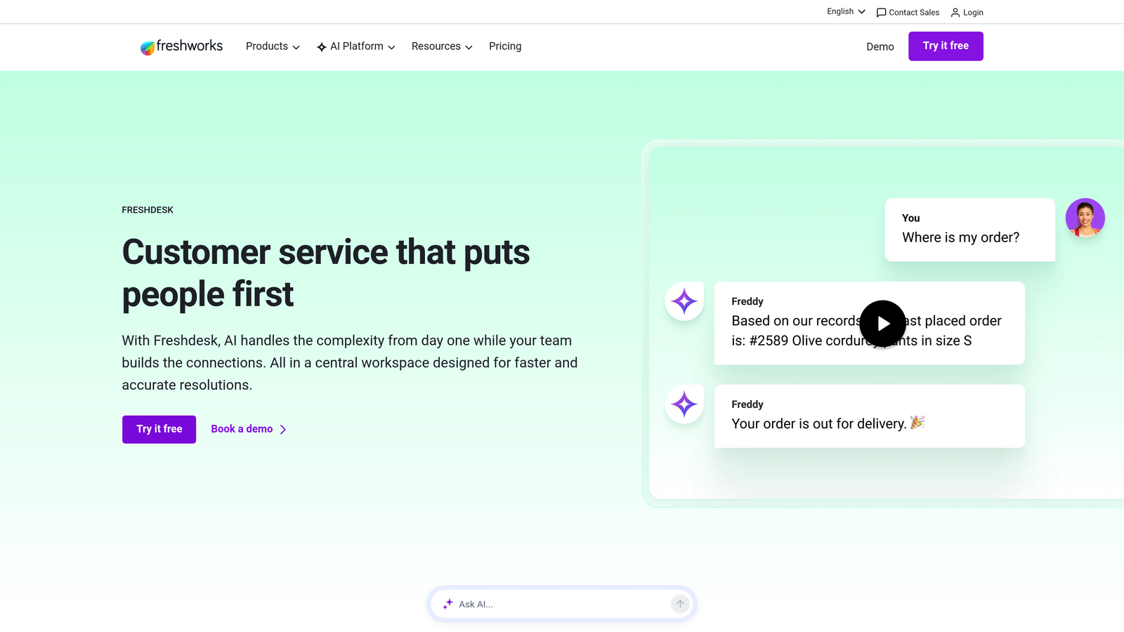
Where This Tool Shines
Freshdesk Analytics earns its place through accessibility. The drag-and-drop report builder is genuinely intuitive — a support manager can build a meaningful CSAT trend report in minutes without touching a query language or calling in a data analyst. That matters for lean teams where everyone wears multiple hats.
SLA monitoring is a particular strength. The breach alerting keeps compliance visible and proactive rather than something you discover after a customer escalates.
Key Features
Drag-and-Drop Report Builder: No SQL or BI expertise required — build custom reports through an intuitive visual interface.
CSAT Tracking: Satisfaction trend analysis with historical comparison to spot shifts in customer sentiment over time.
SLA Compliance Monitoring: Real-time tracking with breach alerts so teams can intervene before SLAs are missed.
Scheduled Reports: Automated delivery of reports via email to keep stakeholders informed without manual effort.
Best For
Small to mid-sized teams running their support operations on Freshdesk who want reliable, no-fuss reporting. Not the right choice if you need cross-platform analytics or data that lives outside the Freshworks ecosystem.
Pricing
Included across most Freshdesk plans. Visit freshworks.com for current tier details.
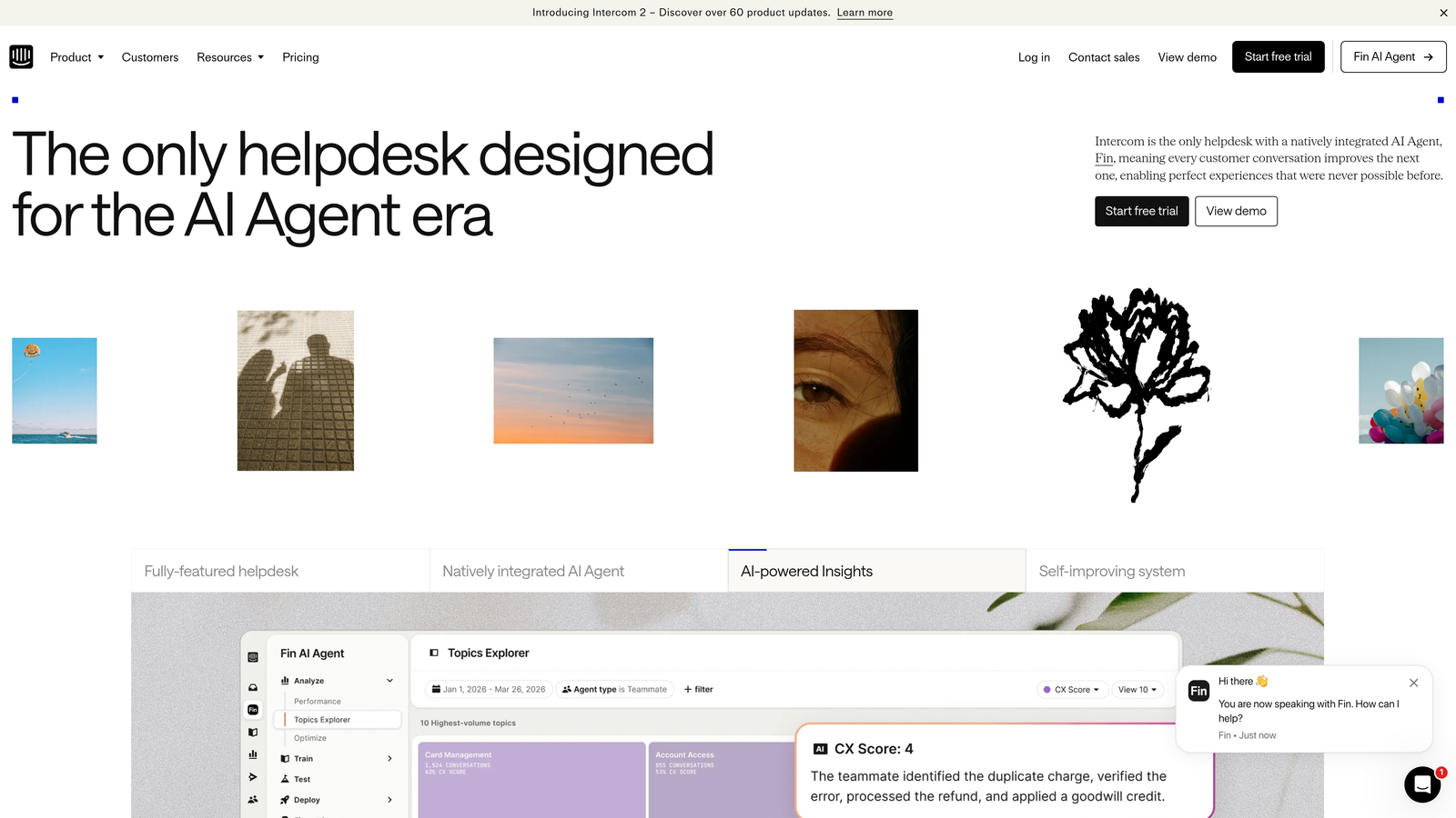
4. Intercom Reports
Best for: Messenger-first support teams tracking AI bot performance and conversation-level quality metrics.
Intercom includes conversation and team analytics with particular depth for teams using Intercom's AI agent (Fin) alongside human support.
Where This Tool Shines
Intercom Reports is purpose-built for the conversational support model. Where other tools measure ticket volume, Intercom measures conversation quality — resolution rates, deflection rates, time-to-close, and the balance between AI-handled and human-handled interactions. For teams running a hybrid AI-human support model, this visibility is essential.
The Fin performance tracking is particularly useful as AI deflection becomes a primary efficiency lever. Understanding which query types Fin resolves confidently versus where it hands off helps teams continuously tune their AI configuration.
Key Features
Conversation-Level Metrics: Resolution rate, time-to-close, and conversation quality tracked at the individual thread level.
AI Agent Performance Tracking: Deflection rate and resolution quality metrics specifically for Fin, Intercom's AI agent.
Team Workload Monitoring: Inbox capacity and workload distribution visibility to prevent agent overload.
CSAT Trend Reporting: Customer satisfaction tracking with trend analysis over configurable time periods.
Best For
Teams already on Intercom running a messenger-first support model, especially those using Fin for AI deflection. The analytics are tightly coupled to Intercom's data model, so they're less useful as a standalone analytics layer for multi-platform operations.
Pricing
Included in Intercom plans. See intercom.com for current pricing.
5. Datadog Customer Experience Analytics
Best for: Technical support teams at engineering-heavy companies who need to correlate ticket spikes with infrastructure events.
Datadog is primarily an infrastructure observability platform, but it has become a go-to tool for DevOps-adjacent support teams who need to bridge the gap between engineering data and support operations.
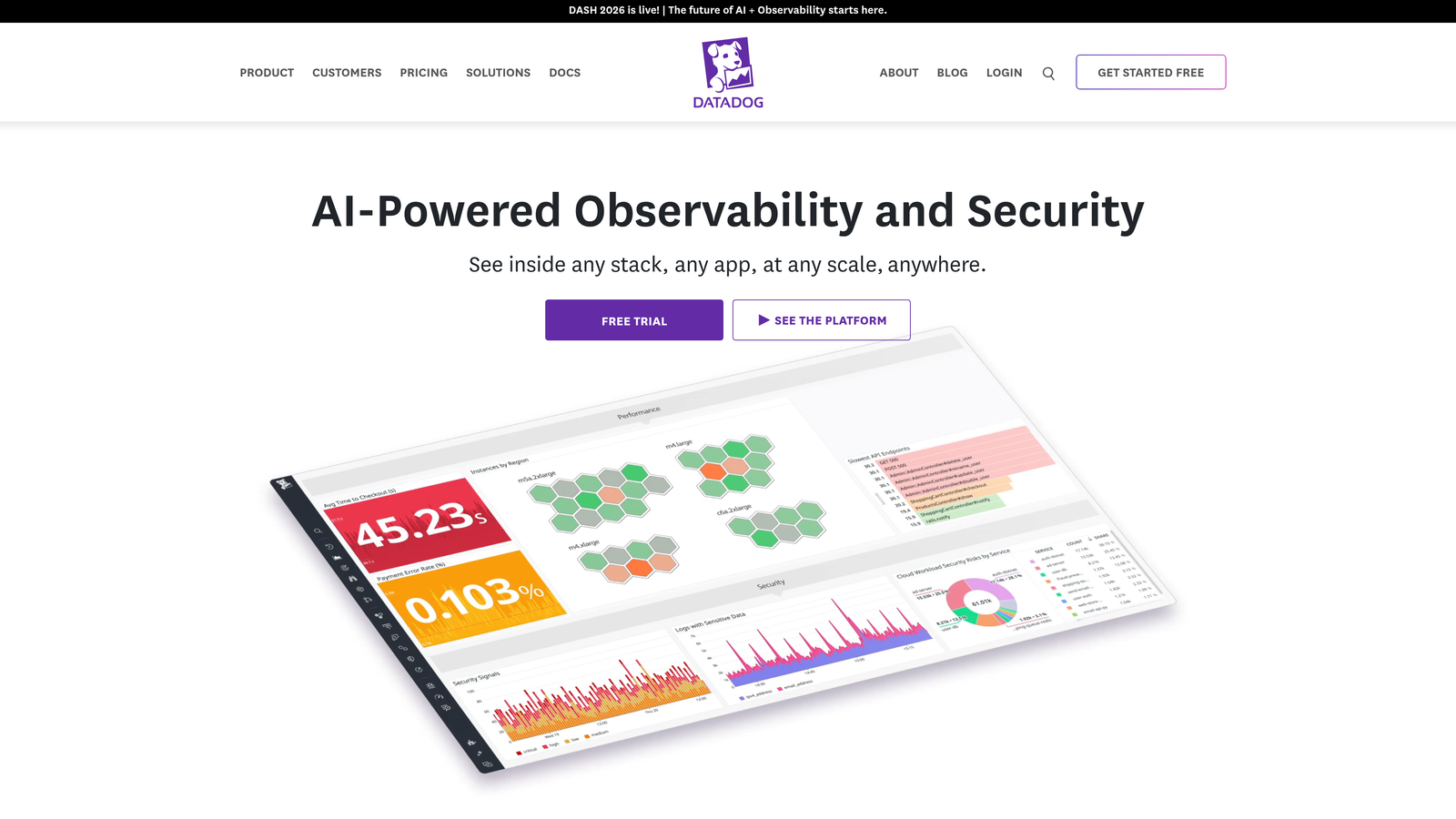
Where This Tool Shines
Datadog occupies a unique position on this list: it's not a support analytics tool in the traditional sense, but for the right team, it's the most powerful option available. When a deployment goes wrong and ticket volume spikes, Datadog can show you the correlation in real time — something no native helpdesk analytics module can do.
This cross-domain visibility is increasingly valuable as product-led SaaS companies blur the line between support operations and engineering operations. If your support team and engineering team share an on-call rotation or a war room, Datadog is the common language.
Key Features
Infrastructure-to-Support Correlation: Connect ticket volume spikes directly to deployment events, infrastructure anomalies, or system health degradation.
Real-Time Anomaly Alerting: Proactive alerts on patterns that typically precede support volume increases.
Custom Cross-Domain Dashboards: Combine engineering telemetry and support context in a single view for unified operational awareness.
Log Management and APM Integration: Application performance data alongside support context for deep root-cause analysis.
Best For
Engineering-heavy companies where support and product teams operate in close proximity. Not a good fit for teams that want traditional CSAT, SLA, and agent performance reporting — Datadog requires significant configuration investment and technical fluency to deliver support-specific insights.
Pricing
Usage-based pricing. See datadoghq.com for current plans.
6. Tableau
Best for: Enterprise teams with dedicated data analysts who need maximum visualization flexibility across support and business data.
Tableau is Salesforce's enterprise BI platform, connecting to helpdesk data via native connectors or APIs and offering unmatched visualization capabilities for teams with the resources to invest in setup.
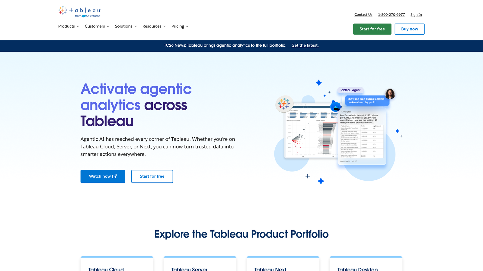
Where This Tool Shines
Tableau's ceiling is higher than almost anything else on this list. If you want to build a dashboard that combines Zendesk ticket data with Salesforce CRM data, product usage analytics, and financial metrics in a single view, Tableau can do it. That kind of cross-departmental intelligence is genuinely difficult to replicate elsewhere.
Tableau Pulse brings AI-generated metric summaries and anomaly alerts into the mix, making the platform more accessible for non-analysts who need to consume insights without building their own queries.
Key Features
Native Helpdesk Connectors: Direct connections to Zendesk, Salesforce Service Cloud, and most major helpdesk platforms without custom API work.
Advanced Visualization Builder: Drag-and-drop chart creation with a wider range of chart types and customization options than any native helpdesk tool.
Cross-Department Dashboards: Combine support, sales, product, and financial data in unified views for executive-level reporting.
Tableau Pulse: AI-generated metric summaries and anomaly detection for teams that want intelligent insights without manual analysis.
Best For
Enterprise support operations with dedicated BI resources and a need for cross-functional reporting. The setup investment is real — teams without a data analyst will struggle to unlock Tableau's full potential for support analytics specifically.
Pricing
Viewer licenses start at approximately $15/user/month. See tableau.com for current pricing across all license types.
7. Looker
Best for: Data-mature organizations on Google Cloud that need consistent, reusable metric definitions across every team and dashboard.
Looker is Google Cloud's enterprise BI platform, distinguished by its LookML semantic modeling layer that lets data teams define metrics once and deploy them consistently everywhere.
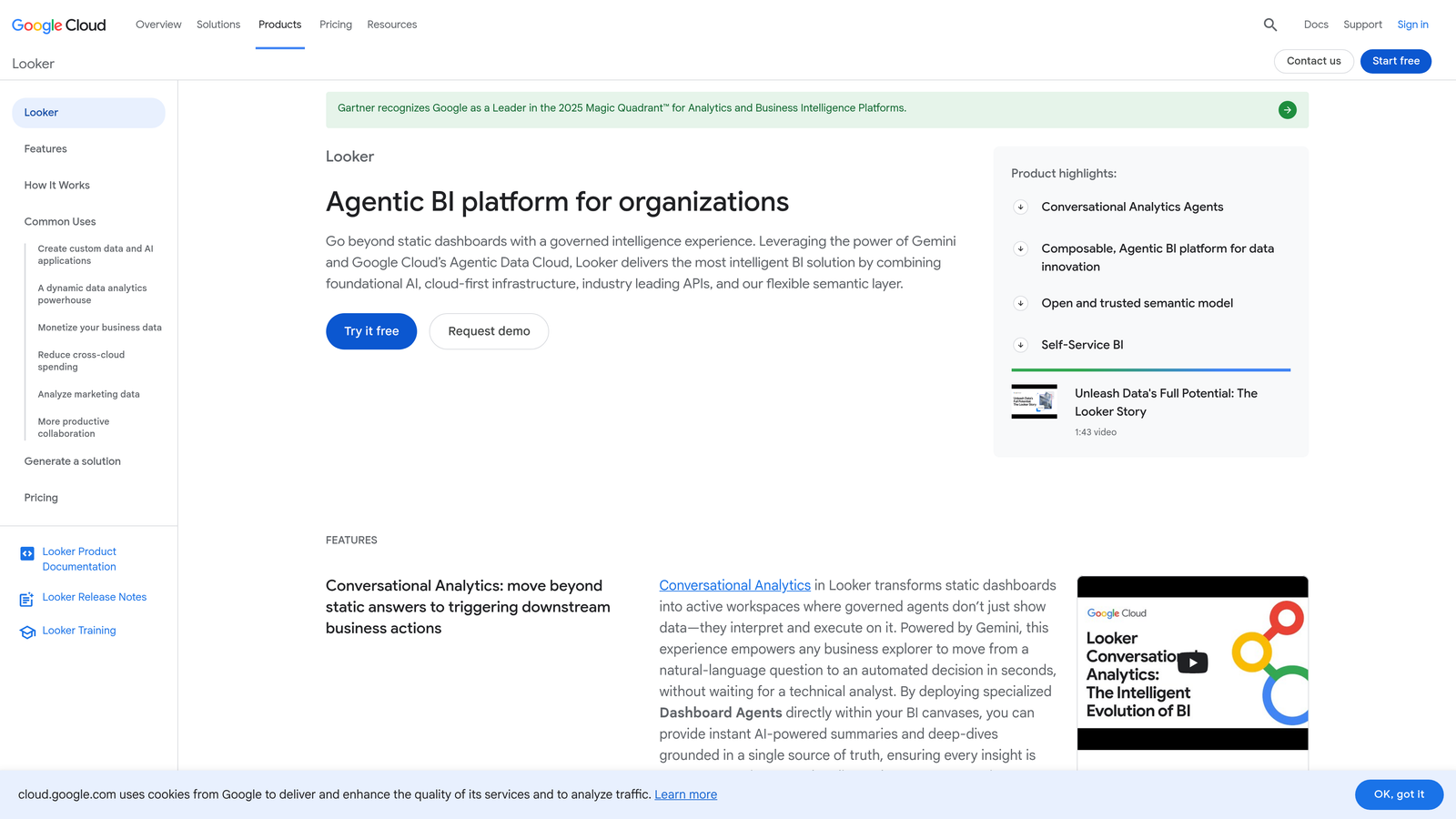
Where This Tool Shines
Looker's LookML layer solves a problem that grows with organizational scale: metric inconsistency. When sales defines "resolution time" differently than support, and support defines it differently than the executive team, dashboards become untrustworthy. LookML enforces a single source of truth across every report and dashboard in the organization.
For companies already invested in BigQuery and the Google Cloud ecosystem, Looker's integration depth is a significant advantage. The embedded analytics capabilities also make it useful for product teams building customer-facing reporting features.
Key Features
LookML Semantic Layer: Define support metrics once in a modeling layer and reuse them consistently across every dashboard, eliminating metric drift across teams.
BigQuery and Google Cloud Integration: Deep native integration for companies already running their data infrastructure on Google Cloud.
Embedded Analytics: Build customer-facing analytics features directly into your product using Looker's embedding capabilities.
Looker Studio (Free Tier): A lighter-weight reporting option for teams that need basic dashboards without full Looker infrastructure investment.
Best For
Data-mature enterprises with dedicated data engineering teams, particularly those already on Google Cloud. Requires meaningful investment in LookML modeling before support dashboards become useful — not a quick-start solution.
Pricing
Enterprise pricing. Contact Google Cloud directly for current rates at cloud.google.com/looker.
8. Klipfolio
Best for: SMB and startup support teams that need always-visible KPI dashboards without enterprise BI complexity or cost.
Klipfolio is a lightweight, fast-setup KPI dashboard tool with pre-built connectors for Zendesk, Freshdesk, HubSpot, and over 100 other data sources.
Where This Tool Shines
Klipfolio's superpower is time-to-value. Where Tableau and Looker require weeks of setup, Klipfolio's pre-built connectors get you from sign-up to a live support dashboard in hours. For a startup support team that needs ticket volume, CSAT, and response time visible on a wall display by end of week, it's hard to beat.
The no-code metric builder keeps things accessible for support managers who don't have a data team behind them. You're not getting the analytical depth of an enterprise BI tool, but for the use cases that matter most to small teams, Klipfolio delivers cleanly.
Key Features
Pre-Built Data Connectors: Ready-to-use integrations for Zendesk, Freshdesk, HubSpot, and 100+ other sources — connect and pull data without custom API work.
Real-Time KPI Dashboards: Live metric displays suitable for TV or wall-mounted screens, keeping support health visible to the whole team.
No-Code Metric Builder: Build and customize KPI metrics through a visual interface without SQL or engineering support.
SMB-Friendly Pricing: Entry-level pricing designed for small support teams that don't need enterprise-scale infrastructure.
Best For
Startup and SMB support teams that want always-on visibility into core support metrics without the setup overhead or cost of enterprise BI tools. Teams that have outgrown native helpdesk reporting but aren't ready for Tableau or Looker.
Pricing
Plans start at approximately $99/month. See klipfolio.com for current pricing.
9. Help Scout Reports
Best for: Customer-centric teams using Help Scout that prioritize relationship quality and conversation health over raw volume metrics.
Help Scout includes native reporting built around conversation quality, happiness scores, and team productivity — reflecting the platform's philosophy that support is fundamentally about relationships.
Where This Tool Shines
Help Scout Reports is opinionated in a good way. Rather than overwhelming you with every possible metric, it surfaces the ones that indicate whether your team is actually serving customers well: happiness scores (Help Scout's CSAT equivalent), response time trends, and conversation quality at the company and customer level.
The customer-level conversation history reporting is particularly useful for teams managing high-touch accounts. Seeing a specific company's full support history in one view — volume, sentiment, resolution patterns — gives context that aggregate metrics can't provide.
Key Features
Happiness Score Tracking: Help Scout's CSAT equivalent with trend analysis and historical comparison to spot shifts in customer sentiment.
Conversation Volume and Response Time: Core throughput metrics with time-series views to identify trends and seasonal patterns.
Team Productivity Metrics: Replies per hour, resolution time, and workload distribution to support capacity planning and performance reviews.
Company-Level Reporting: Customer and company-specific conversation history for account-aware support management.
Best For
Teams already using Help Scout, particularly those in customer-success-adjacent roles where relationship quality matters as much as efficiency. Not a standalone analytics product — the value is tightly coupled to the Help Scout platform itself.
Pricing
Included in Help Scout plans starting at approximately $20/user/month. See helpscout.com for current pricing.
Which Support Analytics Tool Is Right for You?
The right tool depends less on feature lists and more on where your team is today and where you're trying to go.
If you want analytics that go beyond ticket counts and surface business intelligence — churn signals, customer health, revenue context — from within your support workflow, Halo AI is built for exactly that. It's the only tool on this list where the analytics are a byproduct of an intelligent agent layer rather than a separate reporting module bolted on afterward.
If you're deeply invested in Zendesk and need comprehensive native reporting, Zendesk Explore is the natural choice. Similarly, Freshdesk Analytics and Help Scout Reports are the right answers for teams already committed to those respective platforms who want solid reporting without adding another vendor.
For messenger-first teams running AI-human hybrid support, Intercom Reports gives you the conversation-quality and deflection-rate visibility that other tools don't prioritize. If your support team works closely with engineering and you need to correlate ticket spikes with infrastructure events, Datadog is in a category of its own.
Budget-conscious SMB teams that need always-visible KPI dashboards fast will find Klipfolio the most practical starting point. And for enterprises with dedicated data analysts who need maximum flexibility and cross-departmental reporting, Tableau and Looker remain the gold standard — with Looker being the stronger choice for Google Cloud-native organizations.
Your support team shouldn't scale linearly with your customer base. Let AI agents handle routine tickets, guide users through your product, and surface business intelligence while your team focuses on complex issues that need a human touch. See Halo in action and discover how continuous learning transforms every interaction into smarter, faster support.