9 Best Support Performance Tracking Tools in 2026
This guide reviews the 9 best support performance tracking tools in 2026, evaluating each on metrics depth, integration breadth, and ease of implementation for B2B SaaS support teams. Whether you need AI-native business intelligence or purpose-built analytics dashboards, these tools help you move beyond basic ticket counts and turn support data into measurable business outcomes.
 Matt PattoliFounder15 min read
If you can't measure it, you can't improve it — and that's especially true in customer support. Today's support teams are juggling ticket volumes, response times, CSAT scores, agent workloads, and AI resolution rates across multiple platforms. Without the right tracking tools, these metrics live in silos, making it nearly impossible to spot bottlenecks, coach agents effectively, or demonstrate the ROI of your support operation.
The good news is that the tooling landscape has matured considerably. You're no longer limited to basic ticket-count dashboards. Modern support performance tracking tools can surface resolution quality, AI deflection rates, agent efficiency, and even signals that connect support data to customer health and revenue outcomes.
This guide covers the top support performance tracking tools available in 2026 — from AI-native platforms that surface business intelligence alongside support data, to purpose-built analytics dashboards and helpdesk-native reporting. Selections were evaluated on depth of metrics coverage, ease of implementation, integration breadth, and how well they serve B2B SaaS support teams specifically.
1. Halo AI
Best for: B2B SaaS teams that want support performance tracking with embedded business intelligence
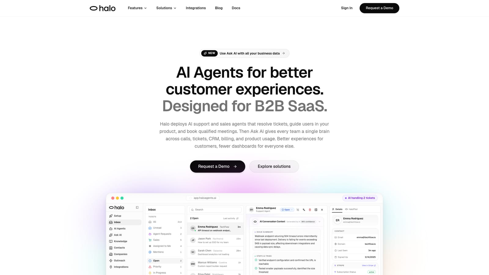
Halo AI is an AI-native customer support platform where performance tracking isn't a bolt-on feature — it's baked into the platform's core architecture.
Where This Tool Shines
Most support analytics tools tell you how many tickets came in and how fast agents responded. Halo AI's Smart Inbox goes further by surfacing why tickets are happening — identifying patterns like product bugs, billing anomalies, feature gaps, and churn risk signals directly from support data. That shifts the conversation from reactive reporting to proactive intelligence.
The page-aware context layer is particularly useful for performance analysis. Because Halo understands which part of your product a user was in when they reached out, you get granular resolution tracking by product area — not just aggregate ticket counts. Combine that with AI agent resolution tracking (what the AI resolved versus what it escalated), and you have a complete picture of where your support operation is performing and where it needs attention.
Key Features
Smart Inbox with Business Intelligence: Surfaces customer health signals, revenue anomalies, and churn risk from support interactions — going beyond standard volume and time metrics.
Page-Aware Context Tracking: Understands which product area generated each ticket, enabling performance analysis by feature or workflow rather than just overall ticket trends.
AI Agent Resolution Tracking: Measures what the AI resolved versus what it escalated to human agents, with continuous learning built in so resolution rates improve over time.
Auto Bug Ticket Creation to Linear: Automatically connects recurring support patterns to engineering workflows, reducing manual effort and closing the loop between support and product teams.
Multi-System Integrations: Connects support data to HubSpot, Stripe, Slack, Intercom, Zoom, PandaDoc, and Fathom for cross-functional reporting that extends well beyond the support inbox.
Best For
B2B SaaS companies that want support performance data to inform product decisions, customer success strategy, and revenue outcomes — not just support operations. Particularly well-suited for teams scaling without adding headcount, where AI resolution rates and escalation patterns matter as much as traditional metrics.
Pricing
Contact for pricing at haloagents.ai. Given the platform's AI-native architecture and business intelligence capabilities, it's positioned for teams with meaningful support volume and cross-functional reporting needs.
2. Zendesk Explore
Best for: Zendesk users who want deep native analytics without leaving their existing helpdesk
Zendesk Explore is the native analytics and reporting product built into the Zendesk Suite, offering pre-built dashboards and a custom query builder for deep ticket and agent performance analysis.
Where This Tool Shines
If your team is already running on Zendesk, Explore removes the integration headache entirely. All your ticket, agent, and customer data is already there — Explore just gives you the reporting layer on top. The pre-built dashboards cover the metrics most support managers care about immediately: CSAT trends, SLA compliance rates, ticket volume by channel, and agent workload distribution.
The custom query builder is where Explore earns its keep for more analytical teams. You can build tailored reports without SQL knowledge, which makes it accessible to support managers who aren't data engineers but still want answers beyond what the default dashboards show.
Key Features
Pre-Built Dashboards: Ready-to-use views for CSAT, SLA compliance, ticket volume, and agent workload — no configuration required to get started.
Custom Query Builder: Build tailored reports using Zendesk's visual query interface without needing SQL or technical expertise.
Team and Agent Performance Comparisons: View metrics at the team level or drill down to individual agent performance over time.
Scheduled Report Delivery: Automatically send reports to stakeholders on a set schedule, keeping leadership informed without manual exports.
Native Zendesk Integration: Seamlessly pulls data from all Zendesk products — Support, Talk, Chat, and Guide — into a unified reporting view.
Best For
Support teams already invested in the Zendesk ecosystem who want robust native reporting without managing a separate analytics tool. Less compelling for teams using multiple helpdesks or needing cross-platform data consolidation.
Pricing
Included in Zendesk Suite Growth at $89/agent/month and above. Not available on the entry-level Suite Team plan, so smaller teams may need to upgrade to access full Explore functionality.
3. Freshdesk Analytics
Best for: Freshdesk users wanting built-in reporting with AI-assisted insight summaries
Freshdesk Analytics is the built-in reporting and analytics module within Freshdesk, offering canned reports, a visual custom report builder, and AI-assisted insight summaries via Freddy AI.
Where This Tool Shines
Freshdesk Analytics follows the same philosophy as Zendesk Explore — native reporting for native helpdesk users — but adds an interesting layer with Freddy AI. The AI-powered insight summaries can surface patterns in your support data without requiring you to build custom reports from scratch, which is particularly useful for smaller teams without dedicated analysts.
The drag-and-drop custom report builder is genuinely accessible. You don't need to understand data modeling to create meaningful views of your ticket trends, agent performance, or SLA adherence. For teams on Freshdesk who want to move beyond the default canned reports, it's a low-friction path to more tailored analytics.
Key Features
Canned Reports: Pre-built reports covering ticket trends, agent performance, SLA adherence, and customer satisfaction — available immediately after setup.
Drag-and-Drop Custom Report Builder: Create tailored reports visually without technical skills or SQL knowledge.
Freddy AI Insight Summaries: AI-powered analysis that surfaces patterns and observations from your support data automatically.
Scheduled Report Exports: Deliver reports to stakeholders via email on a recurring schedule.
Customer Satisfaction Tracking: Built-in CSAT survey collection and trend analysis tied directly to ticket data.
Best For
Freshdesk customers who want more than basic reporting but aren't ready to invest in a separate analytics platform. The Freddy AI summaries make it particularly appealing for lean teams without dedicated data resources.
Pricing
Analytics depth varies by plan. The Growth plan starts at $15/agent/month, though more advanced reporting features are available on higher tiers. Worth reviewing which report types are available at your current plan level before committing.
4. Intercom Reports
Best for: Teams using Intercom's Fin AI alongside human agents who need unified conversation analytics
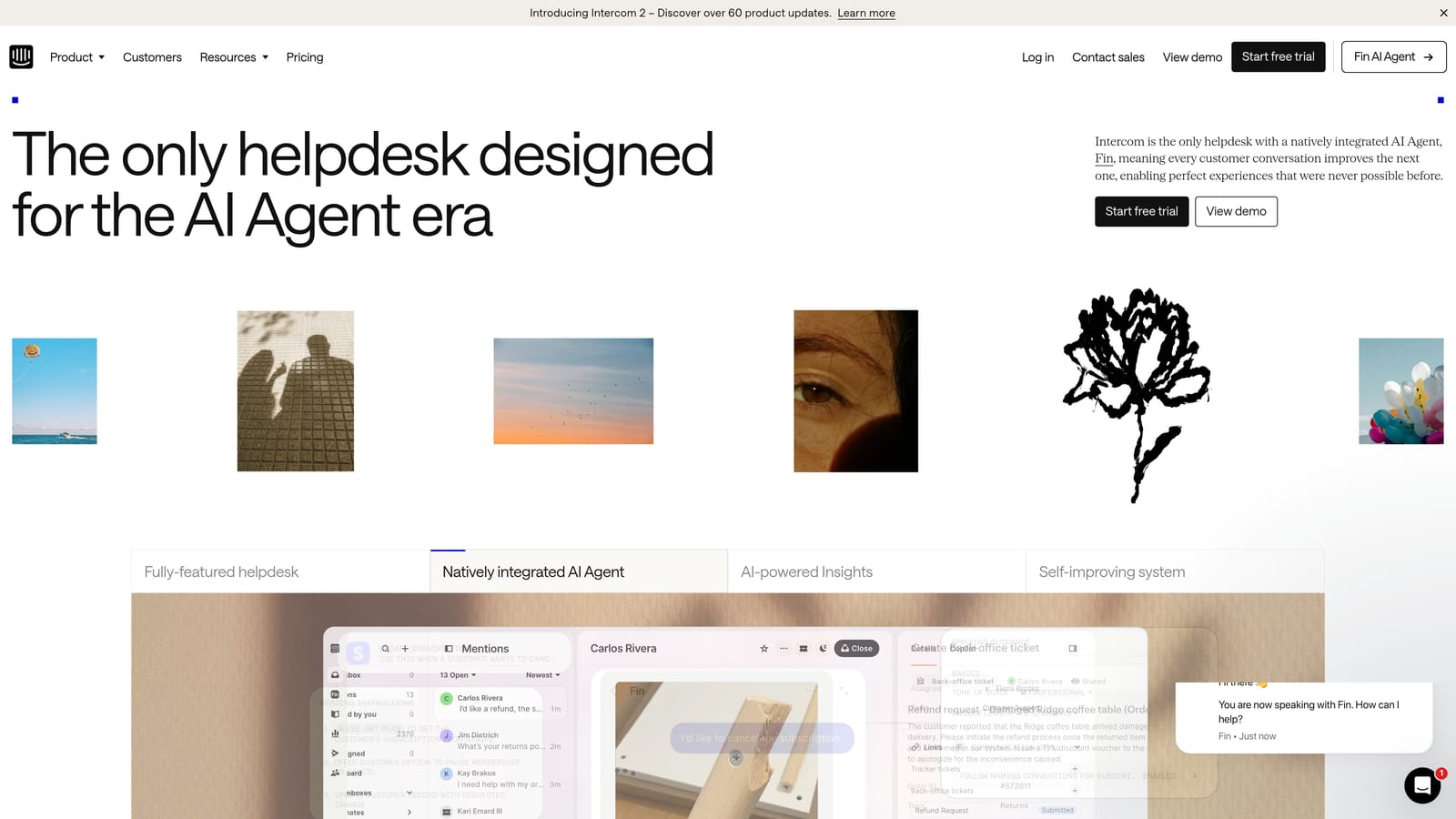
Intercom Reports is the native reporting layer within the Intercom platform, tracking conversation volume, resolution time, CSAT, and AI bot performance in a unified dashboard.
Where This Tool Shines
What makes Intercom Reports stand out is its unified view of human and AI conversation performance. As more teams deploy Intercom's Fin AI bot alongside human agents, understanding how AI and human interactions compare — and where handoffs happen — becomes essential. Intercom Reports provides that visibility natively, without requiring a separate analytics tool.
The conversation tagging and topic analysis features help teams understand not just volume trends, but the nature of what customers are asking about. That qualitative layer adds context that raw ticket counts don't provide.
Key Features
Unified Human and AI Metrics: View conversation data for both human agents and Fin AI in a single dashboard, enabling direct performance comparisons.
Fin AI Resolution and Deflection Tracking: Measure how effectively your AI bot is resolving conversations before they reach human agents.
CSAT Collection and Trend Reporting: Built-in customer satisfaction tracking tied to individual conversations and time periods.
Team and Individual Agent Breakdown: Drill into inbox-level and agent-level performance metrics for coaching and capacity planning.
Conversation Tagging and Topic Analysis: Categorize conversations by topic to understand what's driving volume and where resolution rates vary.
Best For
Teams running Intercom as their primary support and messaging platform, especially those actively using Fin AI and wanting to measure its impact alongside human agent performance. Less useful for multi-platform support operations.
Pricing
Reporting is included in Intercom plans. The Essential plan starts at $29/seat/month, with more advanced reporting capabilities available on higher tiers.
5. Klaus (Klausapp)
Best for: Support teams with formal QA programs who need AI-powered conversation scoring and coaching workflows
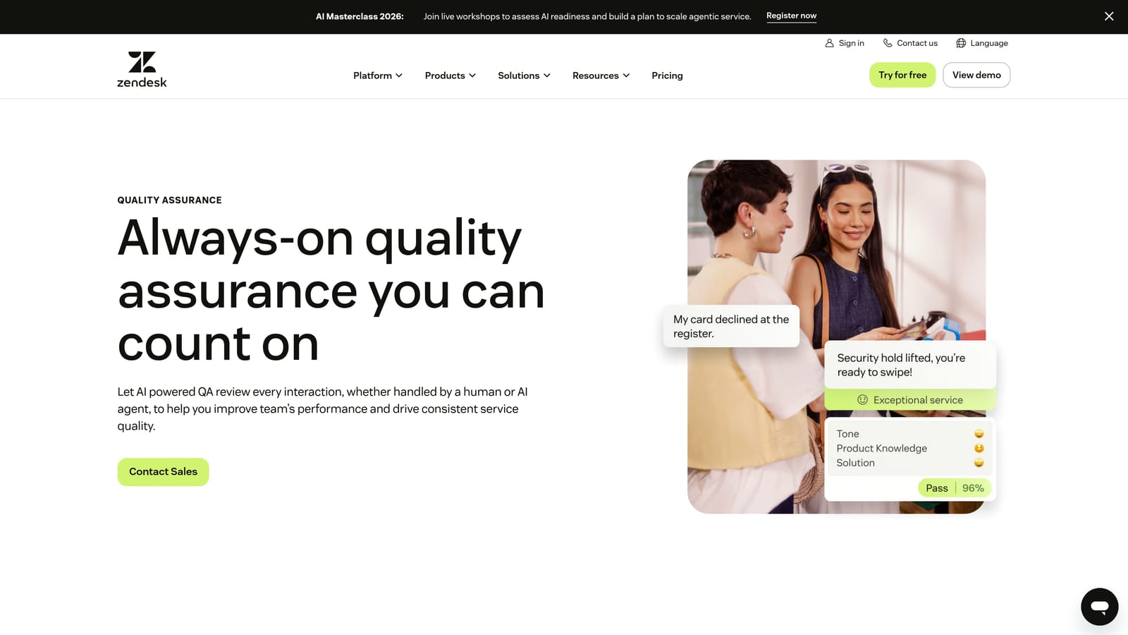
Klaus is a quality assurance and agent coaching platform — now part of Zendesk — that uses AI to score support conversations, identify coaching opportunities, and standardize QA workflows across support teams.
Where This Tool Shines
Klaus approaches support performance from a different angle than most tools on this list. Rather than focusing on volume and speed metrics, it focuses on conversation quality. The AI-powered automated scoring means QA teams don't have to manually review every ticket to understand where agents are excelling or struggling. Klaus samples conversations at scale and surfaces the ones that need attention.
The coaching dashboard is where this translates into action. Managers can see quality trends at the individual and team level, identify specific areas for improvement, and run structured review workflows — all from one interface. For teams serious about agent development, this is a meaningfully different kind of performance tracking.
Key Features
AI-Powered Automated Conversation Scoring: Scores support conversations across all tickets at scale, without requiring manual review of every interaction.
Customizable QA Scorecards: Build review criteria that reflect your team's specific quality standards and values.
Agent Coaching Dashboards: Highlight individual and team-level quality trends with actionable coaching opportunities surfaced automatically.
Cross-Platform Compatibility: Works across Zendesk, Intercom, Freshdesk, and Salesforce Service Cloud — not locked to a single helpdesk.
Team-Level Quality Trend Reporting: Track quality improvements over time at both the individual agent and team level.
Best For
Support organizations with established QA programs, agent development initiatives, or compliance requirements where conversation quality matters as much as speed and volume. Particularly strong for teams managing 10+ agents where manual review becomes unsustainable.
Pricing
Contact Klaus or Zendesk directly for current pricing. Following the Zendesk acquisition, pricing and packaging may have evolved — worth confirming directly with their sales team.
6. Plecto
Best for: Support teams wanting real-time KPI displays with gamification to motivate agents
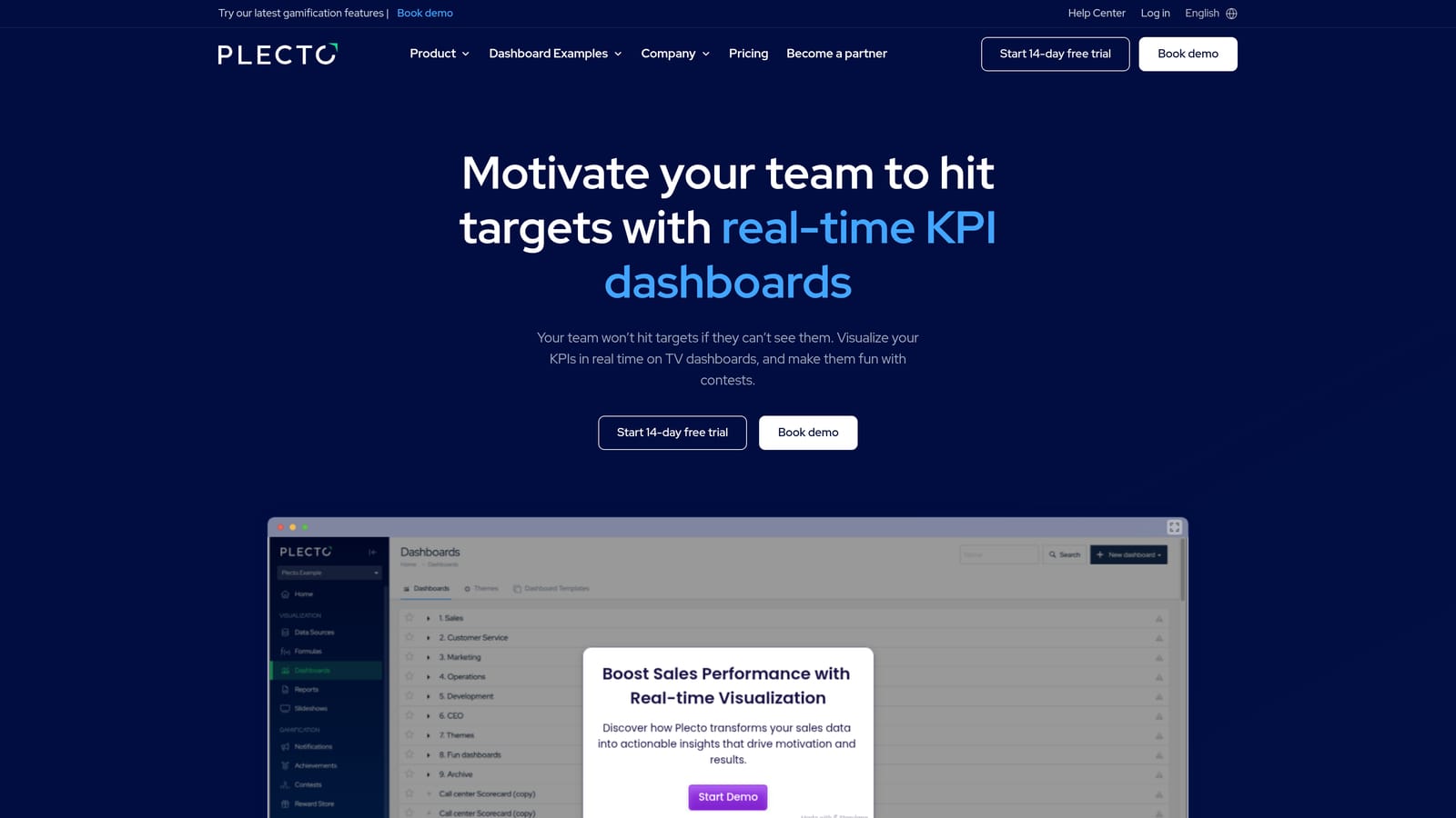
Plecto is a real-time KPI dashboard platform that pulls support data from multiple helpdesks and CRMs, displaying live leaderboards and performance metrics with gamification features designed to motivate support teams.
Where This Tool Shines
Plecto occupies a specific niche: making performance data visible and motivating in real time. If you have a support team working in an office or a hybrid environment where a TV dashboard on the wall can drive healthy competition, Plecto is purpose-built for that use case. The gamification layer — leaderboards, achievements, and real-time notifications when agents hit milestones — adds an engagement dimension that pure analytics tools don't offer.
The multi-source integration capability is also worth noting. Unlike helpdesk-native tools, Plecto pulls from Zendesk, Freshdesk, Salesforce, HubSpot, and others simultaneously, making it useful for teams that aren't consolidated on a single platform.
Key Features
Live KPI Dashboards: Designed for TV screen display and remote team visibility, with real-time data updates throughout the day.
Gamification Features: Leaderboards, achievement badges, and instant notifications when agents hit performance targets.
Multi-Source Integrations: Connects to Zendesk, Freshdesk, Salesforce, HubSpot, and other platforms to consolidate metrics in one view.
Individual and Team Performance Comparisons: View metrics at both the individual agent and team level with side-by-side comparisons.
Drag-and-Drop Dashboard Builder: Build and customize dashboards without any coding or technical expertise.
Best For
Contact centers, office-based support teams, or remote teams with regular team meetings where live performance visibility drives motivation and accountability. Less suited to teams primarily needing deep analytical reporting or trend analysis.
Pricing
Starts at approximately $200/month for small teams. Contact Plecto directly for exact pricing based on team size and data source requirements.
7. Geckoboard
Best for: Support leaders who need clean, shareable KPI dashboards for executive visibility without technical setup
Geckoboard is a lightweight, user-friendly KPI dashboard builder that connects to 90+ data sources — including Zendesk and Intercom — to create clean, shareable dashboards for support leadership and executives.
Where This Tool Shines
Geckoboard's core value proposition is speed and simplicity. You can connect your helpdesk, build a clean dashboard, and share it with leadership in hours — not weeks. There's no data modeling, no SQL, and no IT ticket required. For support managers who need to report upward regularly, that low-friction setup is genuinely valuable.
The shareable dashboard links and scheduled snapshot delivery via Slack or email make stakeholder communication straightforward. Rather than pulling data manually for weekly reports, you set it up once and it runs automatically.
Key Features
90+ Native Data Source Integrations: Connects to Zendesk, Intercom, Freshdesk, and dozens of other platforms without custom development.
Drag-and-Drop Dashboard Builder: Build professional dashboards without any technical skills or data expertise.
TV Dashboard Mode: Optimized for office display on large screens, keeping team metrics visible throughout the day.
Shareable Dashboard Links: Send stakeholders a live link to your dashboard without requiring them to log into another tool.
Scheduled Snapshots: Deliver dashboard screenshots automatically via Slack or email on a set schedule.
Best For
Support managers and directors who need clean executive-facing dashboards and regular stakeholder reporting without involving a data team. Not the right choice for teams needing deep analytical exploration or custom data modeling.
Pricing
Starts at $49/month. Pricing scales with the number of dashboards and data sources, making it accessible for smaller teams while remaining reasonable as usage grows.
8. Datadog
Best for: Technical support teams at SaaS companies who need to correlate ticket spikes with product incidents
Datadog is an infrastructure and application observability platform that technical support teams use to correlate ticket volume spikes with product incidents, deployments, and system errors.
Where This Tool Shines
Datadog isn't a support performance tracking tool in the traditional sense — but for technical support teams at SaaS companies, it fills a gap that no helpdesk-native tool can. When ticket volume suddenly spikes, the question isn't just "how many tickets came in?" it's "what happened in the product that caused this?" Datadog connects those dots by correlating support signals with infrastructure events, deployments, and error logs.
For support teams embedded in technical organizations, having visibility into system health alongside ticket data changes how you triage and communicate. Instead of reacting to ticket volume after the fact, you can see anomalies developing in real time and get ahead of customer impact.
Key Features
Support-to-Infrastructure Correlation: Connect ticket volume spikes to specific deployments, incidents, or system errors happening simultaneously.
Custom Dashboards: Combine product health metrics and support signal data in a single view for technical support and engineering teams.
Anomaly Alerting: Receive alerts when system health anomalies align with unusual support volume patterns.
Log Management and Error Tracking: Surface relevant error context that helps support agents understand and communicate technical issues more accurately.
API Integrations: Pull helpdesk data alongside observability metrics to build cross-functional dashboards.
Best For
Technical support teams and support engineers at SaaS companies where product incidents directly drive ticket volume. Not a fit for teams primarily tracking agent performance or customer satisfaction — those use cases are better served by purpose-built support tools.
Pricing
Free tier available for basic infrastructure monitoring. Pro starts at $15/host/month, though total cost varies significantly depending on which Datadog product modules your team uses.
9. Looker (Google Cloud)
Best for: Data-mature enterprises building fully custom support analytics across multiple business systems
Looker is an enterprise business intelligence platform that allows data-mature teams to build fully custom support analytics models using SQL-based LookML, integrating support data into company-wide reporting.
Where This Tool Shines
Looker is the most powerful option on this list — and also the most demanding to implement. If your organization has a dedicated data team and a data warehouse (particularly BigQuery), Looker lets you build support analytics that are fully integrated with the rest of your business data. You're not limited to what a helpdesk vendor decided to expose in their reporting UI. You can model any relationship across any data source.
The LookML modeling layer is what makes Looker genuinely enterprise-grade. Reusable data definitions mean your support metrics are calculated consistently across every report and dashboard, which matters enormously when leadership is making decisions based on that data.
Key Features
LookML Modeling Layer: Define complex, reusable data models that ensure consistent metric calculation across all reports and dashboards.
Fully Custom Dashboards and Reports: Build any view of your support data without being constrained by a vendor's pre-built report templates.
Embedded Analytics: Share insights across teams by embedding Looker dashboards directly in other tools and workflows.
Native Google Cloud and BigQuery Integration: Purpose-built for organizations running data infrastructure on Google Cloud.
Enterprise Governance and Access Controls: Manage who sees what data with role-based access controls appropriate for large organizations.
Best For
Large enterprises with dedicated data engineering teams who need support analytics integrated into company-wide BI infrastructure. Significant overkill for most support teams — but genuinely powerful for organizations with the resources to implement it properly.
Pricing
Contact Google Cloud for pricing. Looker is typically sold through enterprise contracts, and total cost depends heavily on usage, user count, and Google Cloud consumption.
Which Tool Is Right for Your Support Team?
The right support performance tracking tool depends less on which one has the longest feature list and more on where your team actually is right now — and where you're trying to go.
If you're already deeply invested in a single helpdesk platform, the native analytics tools are the natural starting point. Zendesk Explore and Freshdesk Analytics offer solid coverage of standard support metrics with minimal setup friction. Intercom Reports earns its place specifically for teams running Fin AI alongside human agents, where unified conversation analytics matter.
For teams with formal QA programs and agent development goals, Klaus occupies a category of its own. It's not trying to replace your helpdesk analytics — it's adding a quality intelligence layer that volume metrics can't provide.
If executive visibility and team motivation are the primary goals, Plecto and Geckoboard offer fast time-to-value with real-time dashboards that require minimal technical setup. Datadog serves a specific technical audience: support teams at SaaS companies where product incidents directly drive ticket volume. And Looker is the right call for enterprise organizations with dedicated data teams who need support analytics embedded in company-wide BI infrastructure.
For B2B SaaS teams that want to go beyond surface-level metrics, Halo AI stands apart. Most tools tell you what happened in your support queue. Halo's Smart Inbox tells you why — surfacing customer health signals, revenue anomalies, churn risk, and bug patterns from support data in real time. Combined with page-aware context tracking, AI resolution monitoring, and integrations across your entire business stack, it functions as a business intelligence layer on top of your support operations, not just another dashboard.
Your support team shouldn't scale linearly with your customer base. Let AI agents handle routine tickets, guide users through your product, and surface business intelligence while your team focuses on complex issues that need a human touch. See Halo in action and discover how continuous learning transforms every interaction into smarter, faster support.