8 Best Support Business Intelligence Platforms in 2026
Support business intelligence platforms transform raw helpdesk data — tickets, conversations, and escalations — into actionable insights that reveal product friction, churn risk, and team performance. This guide evaluates the 8 best support business intelligence platforms in 2026, comparing analytics depth, integration ecosystems, and automation capabilities to help support teams make smarter, data-driven business decisions.
 Grant CooperFounder12 min read
Most support teams are sitting on a goldmine of data they never actually use. Every ticket, every conversation, every escalation contains signals about product friction, churn risk, and customer health. But traditional helpdesks bury that intelligence in dashboards that tell you what happened, not what to do about it.
Support business intelligence platforms change that equation. They transform raw support data into actionable insights: which issues are trending, which customers are at risk, where your product is breaking down, and how your team is actually performing. The best tools in this category bridge the gap between support operations and business decisions.
Here are the top platforms for turning your support data into a strategic intelligence layer, evaluated on analytics depth, integration ecosystem, automation capabilities, and how well each connects support signals to real business outcomes.
1. Halo AI
Best for: AI-first SaaS teams that want ticket resolution and business intelligence in a single platform.
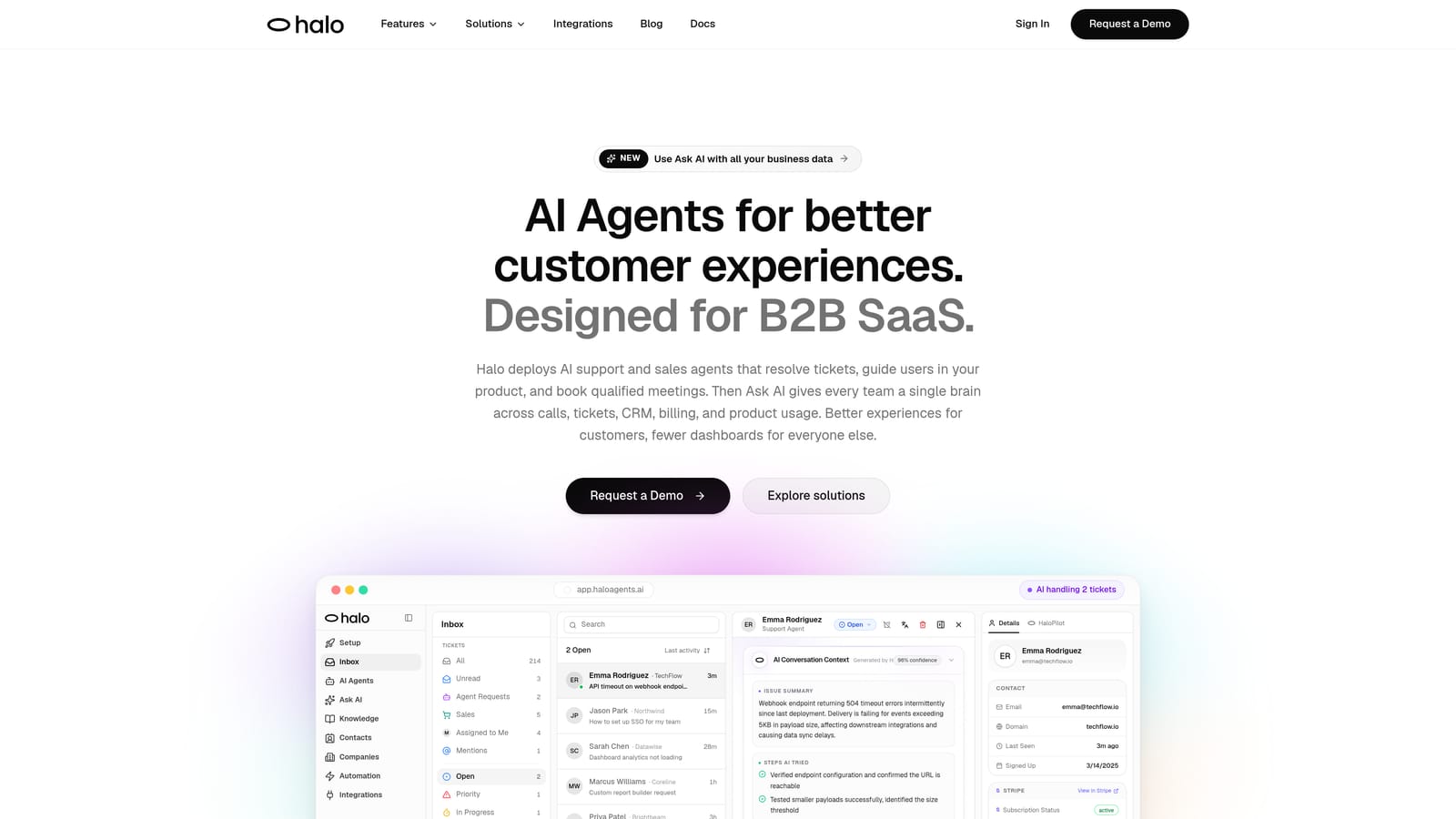
Halo AI is an AI-native customer support platform that embeds business intelligence directly into its Smart Inbox, surfacing customer health signals, revenue anomalies, and product friction patterns without requiring a separate BI tool.
Where This Tool Shines
Most teams that want support intelligence end up stitching together three separate layers: a helpdesk, an AI deflection tool, and a BI platform. Halo collapses all three into one. Its Smart Inbox doesn't just organize tickets; it analyzes them for signals that matter to the business, flagging at-risk accounts, detecting unusual patterns, and surfacing revenue-relevant context from connected systems like HubSpot and Stripe.
The AI-first architecture is worth emphasizing here. Halo wasn't built by bolting AI onto an existing helpdesk. That distinction matters because the intelligence layer learns continuously from every interaction, meaning the system gets smarter over time rather than staying static. For growing SaaS teams, this compounds in a meaningful way.
Key Features
Smart Inbox with Embedded BI: Surfaces customer health signals, anomaly detection, and revenue intelligence directly from ticket and conversation data.
Autonomous AI Agents: Resolve tickets end-to-end and learn from every interaction, improving deflection rates over time without manual retraining.
Page-Aware Chat Widget: Sees what users see in your product, enabling contextual guidance rather than generic responses.
Auto Bug Ticket Creation: Automatically routes identified product issues to Linear or your preferred issue tracker, closing the loop between support and engineering.
Live Agent Handoff: Escalates complex issues to human agents with full conversation context intact.
Deep Integration Ecosystem: Connects to HubSpot, Stripe, Slack, Intercom, Zoom, PandaDoc, Fathom, and Linear for cross-system intelligence.
Best For
SaaS product teams and B2B companies that want to stop managing three separate tools and start treating support as a strategic intelligence layer. Particularly well-suited for teams scaling customer bases without scaling headcount proportionally.
Pricing
Contact for pricing. A demo is available at haloagents.ai/demo for teams that want to see the Smart Inbox and AI agents in action before committing.
2. Zendesk Explore
Best for: Zendesk shops that need native reporting without leaving their existing stack.
Zendesk Explore is the native analytics and reporting module built into the Zendesk platform, offering pre-built and custom dashboards for support operations teams.
Where This Tool Shines
If your team lives in Zendesk, Explore is the path of least resistance for getting reporting up and running. It pulls directly from your ticket and channel data with no connector setup required, and the pre-built dashboards cover the metrics most support managers care about on a daily basis.
The custom report builder is approachable enough for non-technical users, which matters in support environments where the person who needs the data isn't always the person who knows SQL. Where Explore shows its limits is when teams want to blend support data with external sources or move beyond descriptive reporting into predictive or AI-driven insights.
Key Features
Pre-Built Dashboards: Ready-to-use views for CSAT, SLA compliance, ticket volume, and agent performance with no setup required.
Custom Report Builder: Drag-and-drop interface for creating tailored reports without technical expertise.
Scheduled Report Delivery: Automated email delivery of reports to stakeholders on a defined schedule.
Native Zendesk Integration: Accesses all Zendesk ticket, channel, and user data without any connector configuration.
Agent Performance Tracking: Individual and team-level metrics for workload, resolution rates, and response times.
Best For
Support teams already committed to the Zendesk ecosystem that need solid operational reporting. Less suited for organizations that want to correlate support data with CRM, billing, or product analytics from outside the Zendesk stack.
Pricing
Explore is included in Zendesk Suite plans. Explore Professional is available as a paid add-on with advanced features for teams that need more analytical depth.
3. Freshdesk Analytics
Best for: SMB and mid-market teams running their support operations on the Freshworks stack.
Freshdesk Analytics is the embedded reporting module within Freshdesk, providing customizable dashboards and scheduled reports for teams on the Freshworks platform.
Where This Tool Shines
Freshdesk Analytics earns its place through accessibility. The drag-and-drop report builder lets support managers build meaningful dashboards without involving a data analyst, and the pre-built reports cover the core operational metrics that most teams track weekly. For Freshworks users, there's no additional setup or integration work required.
The platform handles the fundamentals well: ticket volume trends, resolution time analysis, CSAT tracking, and group-level performance breakdowns. It's a practical choice for teams that need reliable reporting within their existing toolset, though teams looking for predictive analytics or cross-system intelligence will find themselves hitting the ceiling relatively quickly.
Key Features
Custom Report Builder: Drag-and-drop metric selection for building tailored reports without technical knowledge.
Pre-Built Reports: Covers ticket volume, resolution time, first response time, and agent performance out of the box.
CSAT Tracking: Customer satisfaction collection, trend analysis, and score breakdowns by team or agent.
Scheduled Report Sharing: Automated delivery of reports to stakeholders on a recurring basis.
Group-Level Performance Breakdowns: Segment performance data by team, group, or individual agent for operational visibility.
Best For
Support teams on Freshdesk Growth plans or above that need solid operational reporting without additional tooling costs. Best suited for organizations that aren't yet ready for a dedicated BI platform.
Pricing
Included in Freshdesk Growth plans and above. No additional cost for teams already on qualifying Freshworks tiers.
4. Intercom Reports
Best for: Conversational support teams measuring AI deflection rates and chat-first customer interactions.
Intercom Reports is the built-in reporting suite within Intercom, designed specifically for conversational support metrics and AI performance tracking.

Where This Tool Shines
Intercom Reports is purpose-built for the conversational support model, which makes it genuinely useful for teams where chat and messaging are the primary support channels. The AI deflection and automation tracking is particularly relevant as teams invest more in bot-first workflows and want to understand what's actually being resolved without human involvement.
The conversation-level analytics give managers visibility into handle time, resolution rates, and teammate performance in a format that reflects how Intercom actually works. The reporting feels native rather than bolted on, which is a meaningful usability advantage. The tradeoff is that Intercom Reports is largely confined to the Intercom universe; teams needing revenue-correlated or cross-system intelligence will need to look elsewhere.
Key Features
Conversation Analytics: Resolution rates, handle time, and response time analysis at the conversation level.
AI Deflection Tracking: Measures automation performance and bot resolution rates across your support workflows.
CSAT Reporting: Customer satisfaction collection and trend analysis with teammate-level breakdowns.
Team Inbox Metrics: Visibility into workload distribution and teammate performance across shared inboxes.
Customer Engagement Analysis: Response time and engagement patterns for understanding customer behavior.
Best For
Teams using Intercom as their primary support channel who want reporting that reflects the conversational model. Less suited for organizations needing to blend support data with CRM, billing, or product analytics.
Pricing
Included in Intercom plans. Advanced reporting features are available in higher-tier plans. Check Intercom's current pricing page for specifics, as tiers are updated periodically.
5. Tableau
Best for: Enterprise teams that need to blend support data with CRM, finance, and product data across departments.
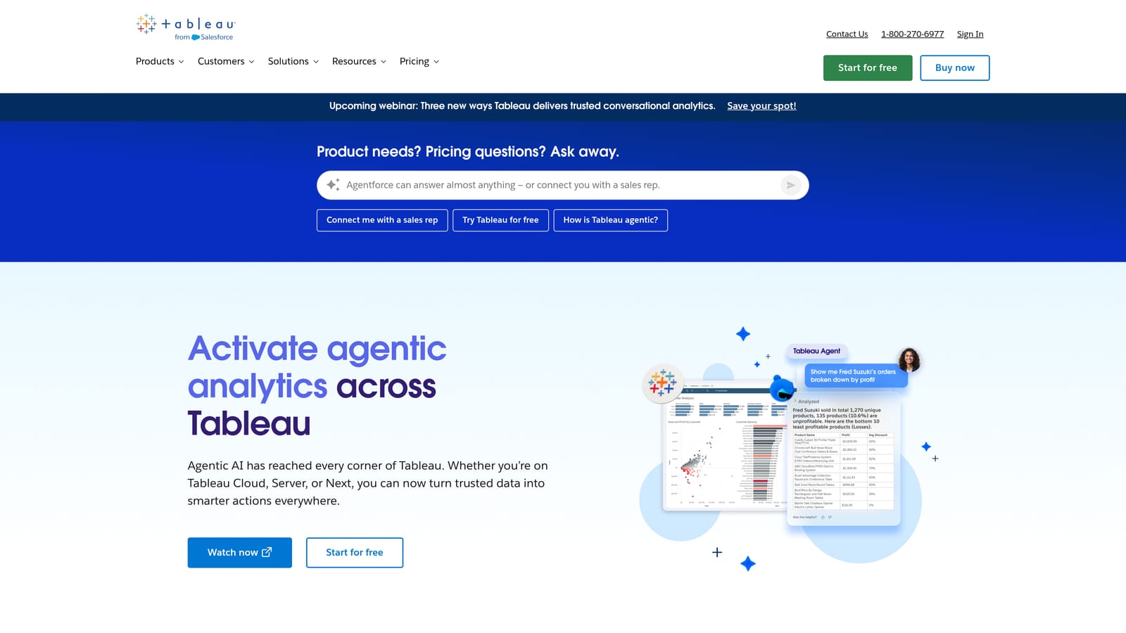
Tableau is Salesforce's enterprise-grade data visualization platform, capable of connecting to virtually any data source and building cross-departmental intelligence from support, revenue, and product data.
Where This Tool Shines
When support data needs to live alongside CRM records, financial metrics, and product analytics in a unified view, Tableau is the tool most enterprise data teams reach for. Its ability to blend sources and build interactive dashboards at scale is genuinely impressive, and the Salesforce integration creates a natural path for organizations already in that ecosystem.
The honest caveat: Tableau is powerful but demanding. Implementing it meaningfully requires a data team, ongoing maintenance, and a clear data strategy. For most SMB or mid-market support teams, it's more infrastructure than they need. But for enterprise operations where support intelligence needs to feed into executive reporting, cross-functional reviews, or revenue forecasting, it's hard to match.
Key Features
Universal Data Connectivity: Connect to helpdesks, CRMs, databases, and data warehouses from a single platform.
Advanced Visualization: Wide range of chart types and interactive dashboard capabilities for complex data storytelling.
Cross-System Data Blending: Combine support, revenue, product, and customer data into unified analytical views.
Salesforce Integration: Native connection to Salesforce CRM for a unified customer view across sales and support.
Enterprise Governance: Role-based permissions, data security controls, and governance features for large organizations.
Best For
Enterprise organizations with dedicated data teams that need support intelligence to feed into cross-departmental reporting and executive dashboards. Overkill for most SMB and mid-market support operations.
Pricing
Tableau Creator starts at approximately $75 per user per month. Enterprise pricing is available for larger deployments. A free trial is offered on Tableau's website.
6. Looker
Best for: Engineering-forward organizations with data warehouses that need governed, reusable metric definitions across teams.
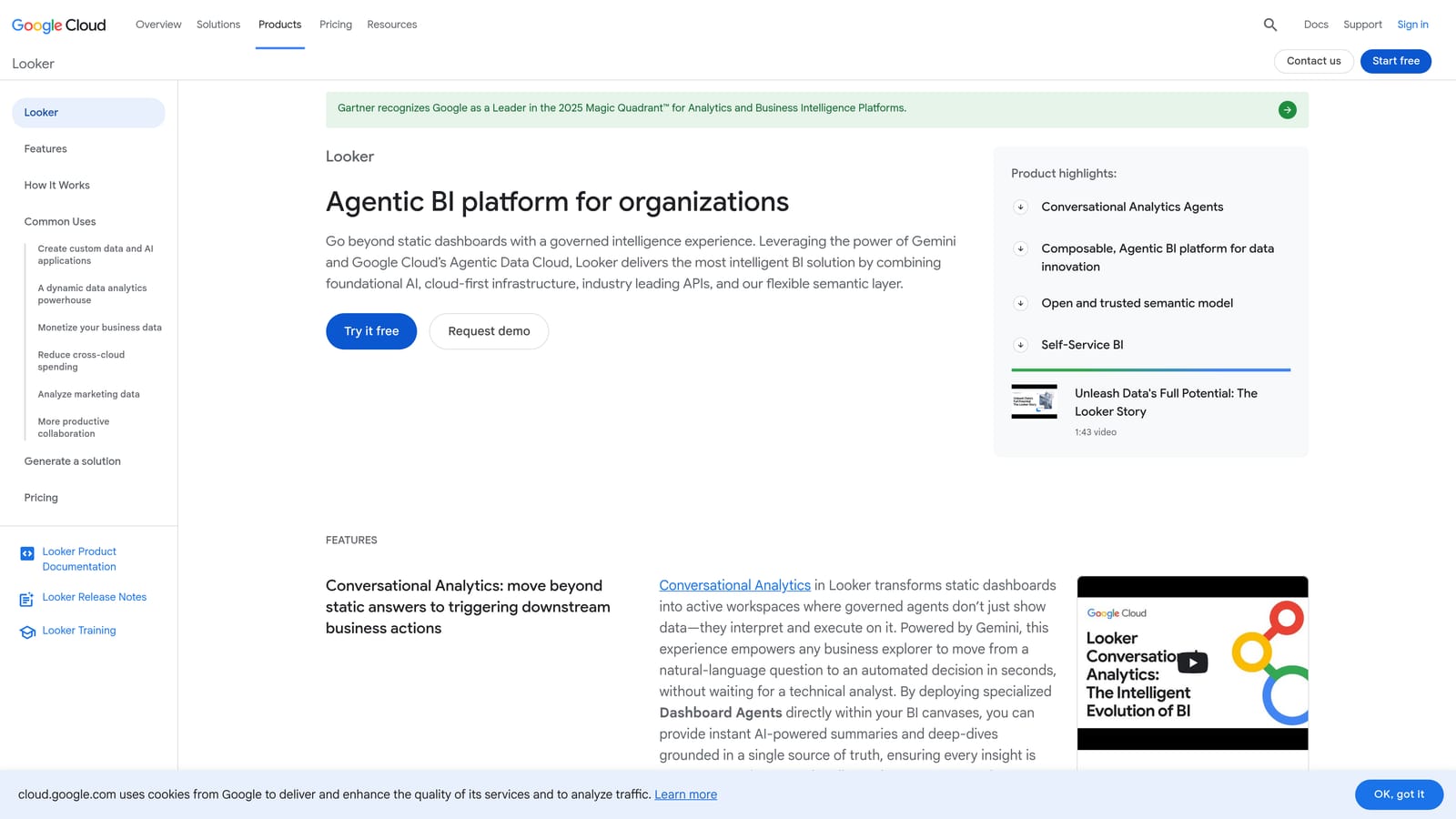
Looker is Google Cloud's enterprise BI platform, distinguished by its LookML semantic modeling layer that enables precise, consistent metric definitions across business units and data sources.
Where This Tool Shines
Looker's semantic layer is its defining advantage. Rather than having different teams calculate the same metrics differently, LookML lets data teams define metrics once and have them used consistently across the organization. For support teams whose data lives in BigQuery or Snowflake, this creates a reliable foundation for cross-functional reporting where "resolved tickets" means the same thing in every dashboard.
The embedded analytics capability is also worth noting for product-led organizations. Looker can power BI directly inside internal tools and customer-facing products, not just standalone dashboards. Like Tableau, the implementation requires real technical resources. This isn't a tool a support manager stands up on a Tuesday afternoon; it's a platform that data engineering teams build on over time.
Key Features
LookML Semantic Layer: Define metrics once and reuse them consistently across teams, eliminating conflicting definitions.
Data Warehouse Connectivity: Native connections to BigQuery, Snowflake, Redshift, and other major warehouses.
Embedded Analytics: Build BI capabilities into internal tools and products rather than standalone dashboards.
Scheduled Data Delivery: Automated report delivery and data alerts for stakeholders across the organization.
Access Control and Governance: Granular permissions and data governance features for enterprise compliance requirements.
Best For
Data-mature organizations with engineering resources and existing data warehouse infrastructure. Best suited for teams where support data is one input into a broader company-wide analytics strategy.
Pricing
Custom enterprise pricing. Contact Google Cloud directly for quotes. No standard self-serve pricing is publicly listed.
7. Klipfolio
Best for: Teams that want real-time KPI dashboards without SQL knowledge or a dedicated data team.
Klipfolio is a lightweight, connector-rich dashboard platform that brings support KPIs into a single real-time view, designed for teams that need visibility without complexity.
Where This Tool Shines
Klipfolio occupies a useful middle ground between native helpdesk reporting and enterprise BI platforms. It connects to Zendesk, Freshdesk, Intercom, and over a hundred other tools without requiring any technical setup, making it accessible to support managers who need cross-tool visibility but don't have a data team to call on.
The real-time data refresh is a practical differentiator for support operations where conditions change quickly. Rather than waiting for a daily report, managers can see live ticket volume, queue depth, and SLA status in a single view. Klipfolio is better understood as a dashboard display tool than a deep analytics platform; it excels at surfacing what's happening right now, less so at explaining why or predicting what comes next.
Key Features
Pre-Built Connectors: Integrates with Zendesk, Freshdesk, Intercom, and 100+ other tools without technical configuration.
Real-Time Data Refresh: Live KPI monitoring with up-to-date data for fast-moving support environments.
No-Code Dashboard Builder: Drag-and-drop interface requires no SQL or technical expertise to use.
Shareable Dashboards: Share views with team members and stakeholders without requiring platform access.
Goal Tracking and Alerts: Set metric thresholds and receive alerts when KPIs move outside acceptable ranges.
Best For
Support managers and team leads who need cross-tool KPI visibility in real time without the overhead of enterprise BI. Well-suited for small to mid-sized teams on mixed helpdesk stacks.
Pricing
Plans start at approximately $125 per month. A free trial is available for teams that want to test connectors and dashboard building before committing.
8. Geckoboard
Best for: Support teams that want always-on KPI visibility on shared screens, TV displays, or remote team dashboards.
Geckoboard is a real-time KPI dashboard tool built for team-wide visibility, with native helpdesk integrations and a focus on clean, display-ready layouts.
Where This Tool Shines
Geckoboard's design philosophy is refreshingly focused: make important metrics impossible to ignore. Its TV-ready dashboard layouts are built for support floors, shared screens, and remote team setups where everyone needs to see the same numbers at a glance. The visual clarity is genuinely better than most tools in this category for that specific use case.
Setup is fast. Native integrations with Zendesk, Freshdesk, and Intercom mean most support teams can have a live dashboard running within an hour. Like Klipfolio, Geckoboard is a display and visibility tool rather than an analytical platform. It won't tell you why ticket volume spiked or which customer segments are most at risk, but it will make sure your whole team knows the moment something goes off track.
Key Features
Native Helpdesk Integrations: Direct connections to Zendesk, Freshdesk, and Intercom with no technical setup required.
TV-Ready Dashboard Layouts: Optimized for display screens in support environments and remote team visibility.
Real-Time Data Updates: Live metric displays with clean, readable formatting designed for at-a-glance consumption.
Simple Setup: No technical expertise required; most teams are live within an hour of connecting their data sources.
Shareable Dashboard Links: Generate shareable links for stakeholder reporting without requiring a Geckoboard account.
Best For
Support teams that prioritize live team-wide visibility over deep analytics. Particularly effective for in-office support floors and distributed teams that want shared situational awareness across time zones.
Pricing
Plans start at approximately $49 per month. A 14-day free trial is available with no credit card required.
Which Platform Is Right for Your Team?
The right choice here depends less on which tool has the most features and more on where your team sits in its data maturity journey and what decisions you actually need support intelligence to drive.
For AI-first SaaS teams that want ticket resolution, deflection, and business intelligence from a single platform without stitching together three separate tools, Halo AI is the standout choice. It's the only platform on this list that combines autonomous AI agents with embedded BI, meaning your support operation generates strategic intelligence as a byproduct of resolving tickets, not as a separate analytical exercise.
If your team is already committed to a specific helpdesk ecosystem, the native options are the logical starting point. Zendesk Explore for Zendesk shops, Freshdesk Analytics for Freshworks users, and Intercom Reports for conversational support teams all deliver solid operational reporting without adding new tooling overhead.
For enterprise organizations that need support data to feed into cross-departmental reporting alongside CRM, finance, and product analytics, Tableau or Looker are the appropriate choices. Both require meaningful technical investment, but they offer the data blending and governance capabilities that complex organizations need.
When the goal is real-time team visibility without analytical depth, Klipfolio and Geckoboard both deliver. Geckoboard edges ahead for teams with shared screens and support floors. Klipfolio is the better pick when you need slightly more flexibility in how you combine and display metrics from multiple sources.
Your support team shouldn't scale linearly with your customer base. Let AI agents handle routine tickets, guide users through your product, and surface business intelligence while your team focuses on complex issues that need a human touch. See Halo in action and discover how continuous learning transforms every interaction into smarter, faster support.